25 top character design tips
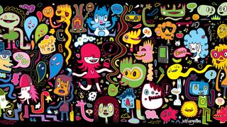
Character design can be a tricky beast to tackle. You may know how to draw dynamic characters, but designing your own character from scratch involves a lot of creative thinking. Although many of the classic characters familiar to us all through cartoons, movies and advertising look simple, that simplicity usually belies the many hours of work that have gone into their development.
From Mickey Mouse's famous three-fingered hands – drawn to save production time when he was first developed for animations in the 1920s – to the elegant simplicity of Homer Simpson, character design has always been about keeping it simple.
But aside from clean lines and easily readable features, what else are you going to need to know about character design and illustration? There's knowing what to exaggerate and what to play down, what to add to give a hint of background and depth, and what to do to develop personality.
Getting started can be the trickiest part in any character design project, but once you've got some ideas, these tips will help you breathe life into your creation.
01. Decide who your character design is aimed at

Deciding who the character is aimed at should be one of the first steps in your design process
Think about your audience. Character designs aimed at young children, for example, are typically designed around basic shapes and bright colours. If you're working for a client, the character's target audience is usually predetermined, as Aussie artist Nathan Jurevicius explains.
"Commissioned character designs are usually more restrictive but no less creative. Clients have specific needs but also want me to do my 'thing'. Usually, I'll break down the core features and personality."
"For example, if the eyes are important then I'll focus the whole design around the face, making this the key feature that stands out."
02. Decide where your character will appear
Where will the character design be seen and in what medium? This will have a direct bearing on how you go about your character design. For example, if it's for a phone screen, there's no point designing it to have a lot of intricate details and features.
Jurevicius says that regardless of the format: "The process of thinking up concepts always starts the same: paper, pencil, green tea... lots of thumbnails, written ideas, scratches and sketches over sketches."
If it's tools you're missing, then don't miss our post on the best pencils for sketching, colouring and drawing.
03. Research other designs
It can be helpful to try and deconstruct why certain character designs work and why some don't. There's no shortage of research material to be found, with illustrated characters appearing everywhere: on TV commercials, cereal boxes, shop signs, stickers on fruit, animations on mobile phones, and more.
Study these character designs and think about what makes some successful and what in particular you like about them.
"When you work with characters you need to be inspired," advises animator and illustrator Pernille Ørum, "and you can do this through research. Your mind is a visual library that you can fill up. Try to notice people around you – how they walk, their gestures, how they dress – and use that in your design.
"Photos found online, in magazines or that you’ve taken yourself can lead to a great source of original inspiration. For example, 1950s advertising had a great limited colour palette, which can be a great inspiration."
04. Make an effort to work fast
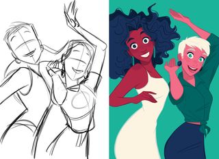
Loose drawings are packed with movement and life
"When starting out on your character design, don’t get caught up in the details," says Ørum. "Decide what you’re trying to communicate, then create loose sketches with movement, acting and flow."
"As soon as you start to tighten up the drawing, you’ll automatically lose some of the dynamic, so it’s important to have as much life in the early stages as possible. Movement is all but impossible to add later, so make sure it’s in the initial sketch. Work quick and do more than one drawing to test your idea."
05. Make your character distinctive
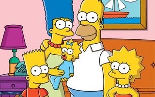
Matt Groening used yellow to make The Simpsons characters stand out from the crowd
Whether you're creating a monkey, robot or monster, you can guarantee there are going to be a hundred other similar creations out there. Your character design needs to be strong and interesting in a visual sense to get people's attention.
When devising The Simpsons, Matt Groening knew he had to offer the viewers something different. He reckoned that when viewers were flicking through TV channels and came across the show, the characters' unusually bright yellow skin colour would grab their attention.
06. Create clear silhouettes
Advertisement
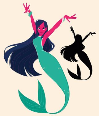
A silhouette helps you understand the character's gesture
Another good way to make your character distinct and improve its pose, says Ørum is to turn it into a silhouette. "Then you can see how the character ‘reads’ and if you need to make the gesture more clear. Do you understand the emotion of the character and see the line of action? Can things be simplified? Try not to overlap everything, and keep the limbs separate."
07. Develop a line of action
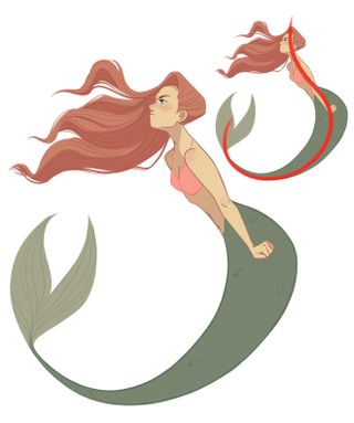
A line of action is the backbone of a character drawing
"A key tool in character design is the line of action," says Ørum. "It’s when you first capture the pose and reveal the direction of the design. A line of action can help create an efficient narrative and conveys the movement. Try to bring the line of action all the way out to the extremities."
"A ballet dancer is a good example: they emphasise the line from the tips of their toes to the tips of their fingers. The line of action is also easier to see in creatures with fewer limbs, which is why mermaids are an ideal subject for developing a strong line of action."
08. Use line qualities to describe your character
Advertisement
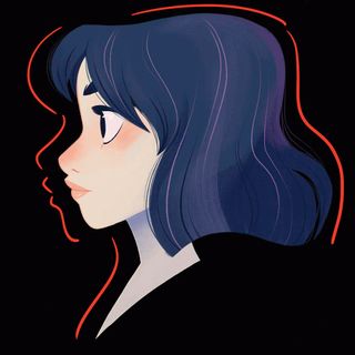
Straight and curved lines are read by your eyes at different speeds
The drawn lines of which your character design is composed can go some way to describing it. Thick, even, soft and round lines may suggest an approachable, cute character, whereas sharp, scratchy and uneven lines might point to an uneasy and erratic character.
Sune Ehlers ' characters are bold and seem to dance on the page, which echoes his approach to drawing them. He explains: "Drawing a doodle is about decisive pen-manoeuvring. A strong line for me comes from strength and rhythm."
Ørum recommends balancing straight and curved lines. "Straight lines and curves gives your character design a rhythm. A straight line (or a simple line) leads the eye quickly, while a curved (or detailed line) slows down the eye."
"A good design achieves a pleasing balance between compression and stretch – complex and simple – while adding life and movement, even within the design. Even a neutral pose can lead the eye by applying these two approaches, resulting in an effective character design."
09. Exaggerate their characteristics
Exaggerating the defining features of your character design will help it appear larger than life. Exaggerated features will also help viewers to identify the character's key qualities.
Exaggeration is key in cartoon caricatures and helps emphasise certain personality traits. If your character is strong, don't just give it normal-sized bulging arms, soup them up so that they're five times as big as they should be.
10. Keep it simple
Advertisement

Minimal details help to draw and guide the viewer's attention
As well as knowing when to exaggerate, Ørum is also keen to highlight the importance of simplicity. "I always try to communicate the designs with the fewest lines possible. It doesn’t mean that work hasn’t been put into creating the volume, placement and design of the character, but I try to simplify as much as possible and only put down the lines and colours that conveys the necessary information."
"This is easy to see in my animation-like style, but it also applies if you do highly rendered artwork. Try to simplify your work and identify what you want the viewer to see."
11. Choose colours carefully
Advertisement
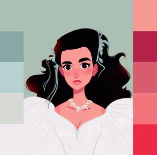
Complementary colours create a pleasing balance
Colours can help communicate a character's personality. Typically, dark colours such as black, purples and greys depict baddies with malevolent intentions.
Light colours such as white, blues, pinks and yellows express innocence, good and purity. Comic-book reds, yellows and blues might go some way to giving hero qualities to a character design.
"To choose effective colours, it’s important to understand the basic rules of colour," explains Ørum. "Become familiar with the primary, secondary and tertiary colours, as well as monochromatic and complementary colours. One technique for generating an effective colour palette is to chose two complementary colours and work with them in a monochromatic colour scheme."
"You’ll create balance because complementary colours create dynamism, while monochrome colours invoke feelings of calm. You could also try a tertiary colour scheme, which adds a third colour (for example, violet, orange and green), and then work with monochromatic versions of those colours, but it demands more planning and skill for it to work well. If you’re new to colour, try and keep it simple."
To read more on this, see our post on colour theory.
12. Give you hair detail
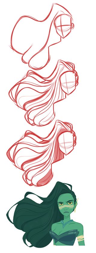
Shape, divide and hairline are the secrets to drawing good hair
"Some years ago I went from hating drawing hair to loving it," Ørum. "Previously, I used to view working out all the details and directions of the hair as a tedious endeavour. Now I think of it more as a large, organic shape, which like a flag in the wind indicates and emphasises the movement of the character or its surroundings."
"Start by creating a large shape and divide it into shorter sections, while thinking about where the hair is parted and where the hairline is. Every line should help to define the volume, shape and direction of the hair."
13. Add accessories
Advertisement
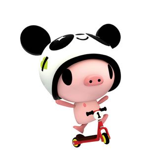
Piggle, a vinyl toy design by TADO, interacts with its accessories
Props and clothing can help to emphasise character traits and their background. For example, scruffy clothes can be used for poor characters, and lots of diamonds and bling for tasteless rich ones.
Accessories can also be more literal extensions of your character's personality, such as a parrot on a pirate's shoulder or a maggot in a ghoul's skull.
14. Consider if 2D or 3D is best
Depending on what you have planned for your character design, you might need to work out what it will look like from all angles. A seemingly flat character can take on a whole new persona when seen from the side if, for example, it has a massive beer belly.
If your character is going to exist within a 3D world, as an animation or even as a toy, working out its height, weight and physical shape is all important.
15. Give your character personality
Interesting looks alone do not necessarily make for a good character design; its personality is key as well. A character's personality can be revealed through comic strips and animations, where we see how it reacts to certain situations.
The personality of your character doesn't have to be particularly agreeable, but it does need to be interesting (unless your characters is purposely dull). Personality can also be expressed simply in how the character has been drawn.


No comments:
Post a Comment
Note: Only a member of this blog may post a comment.