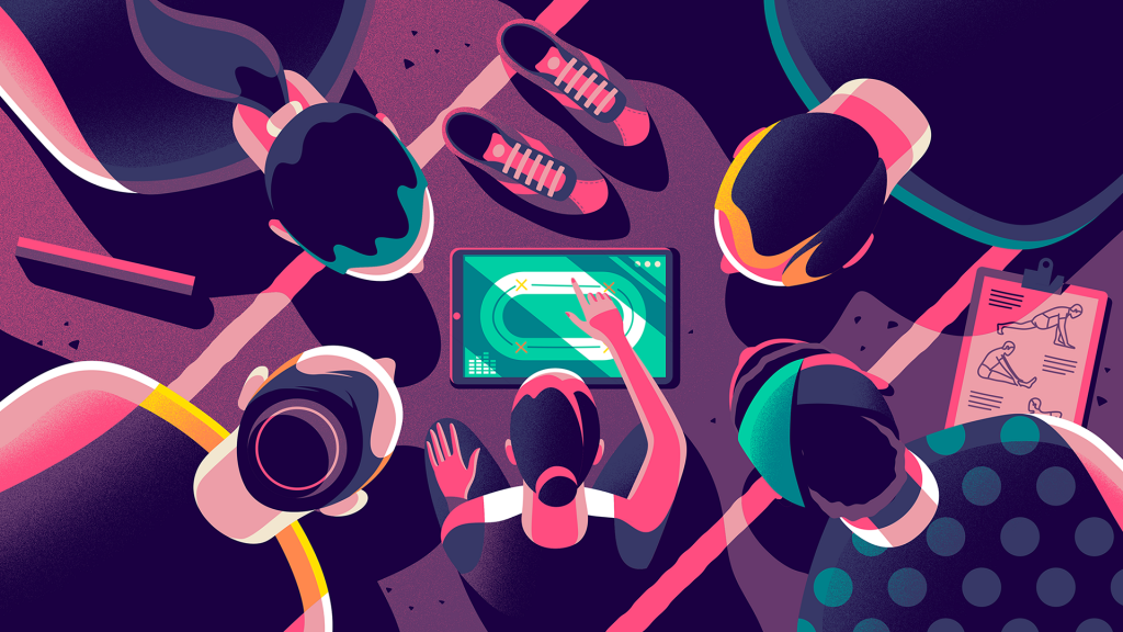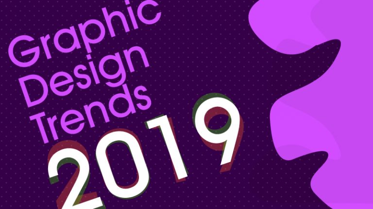
Welcome to our most popular yearly edition of Graphic Design Trends for the upcoming year.
2018 was a year where taking risks in design were considered normal and part of the trend. Thanks to the designer community who have made the terms like ‘minimal’, ‘bold’, ‘distorted’, ‘asymmetrical’ also a trendy word in the design field.
Now, taking hard decisions in design is acceptable and is also received well amongst the design aspirants. 2019 is going to be a year where all the creative findings in 2018 will be used even more common and revolutionize the way we see the design.
Without much delay, let’s jump into the graphic design trends for 2019. Again these are just predictions based on the buzz in the design industry as of now.
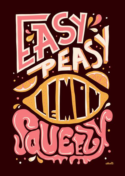
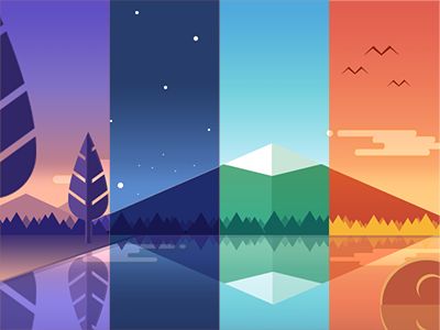
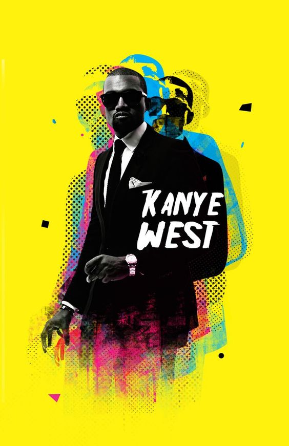
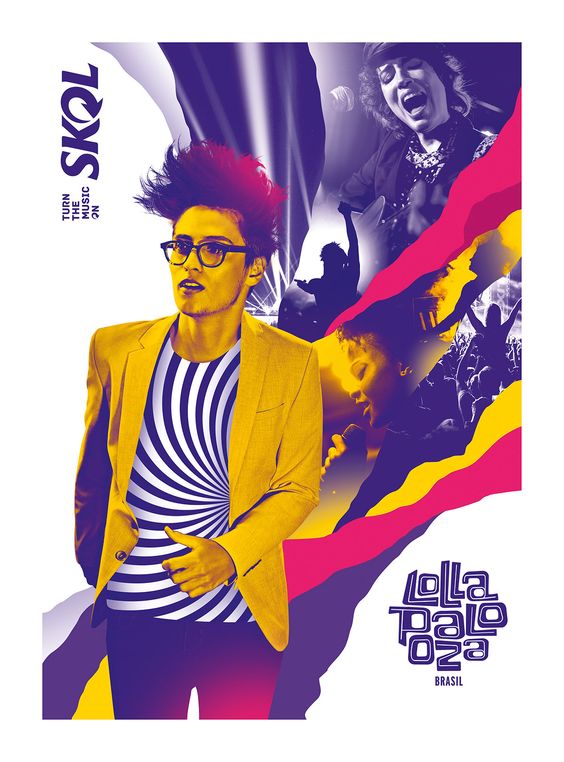
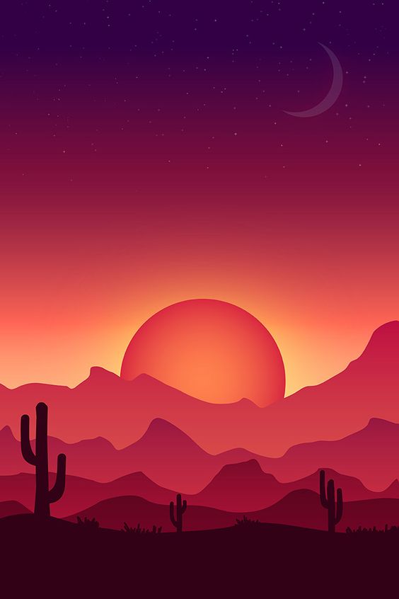
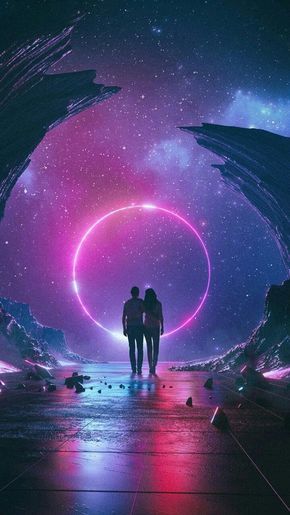
Pop up colors, blue and violet pops: the color of the year
Colors have become the key drivers of attractive designs. The pop up color trends are beyond belief and purple was one of the dreamy colors in 2018. Hopefully, it will crown the same place in 2019 along with astonishing blue. Have a look at the images below. Look into our Pinterest board on
Purple kingdom for more.
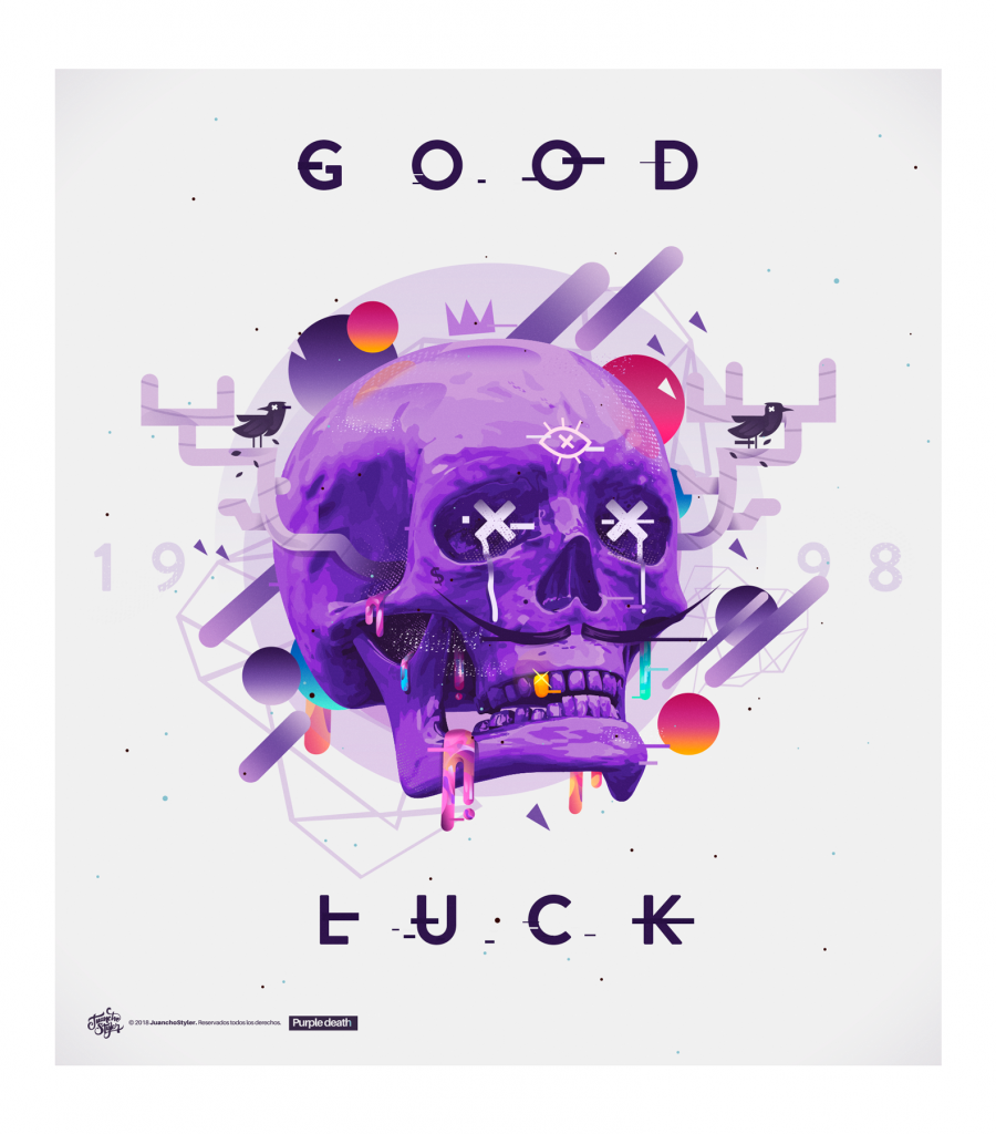
Freaky purple with enormous combinations
Enchanting blue cracking the entire view
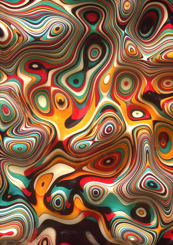
Colors filled. Combinations without gradients
Peculiar red popup
Interesting combinations like tomato red and butter color serves as an eye-candy for viewers.
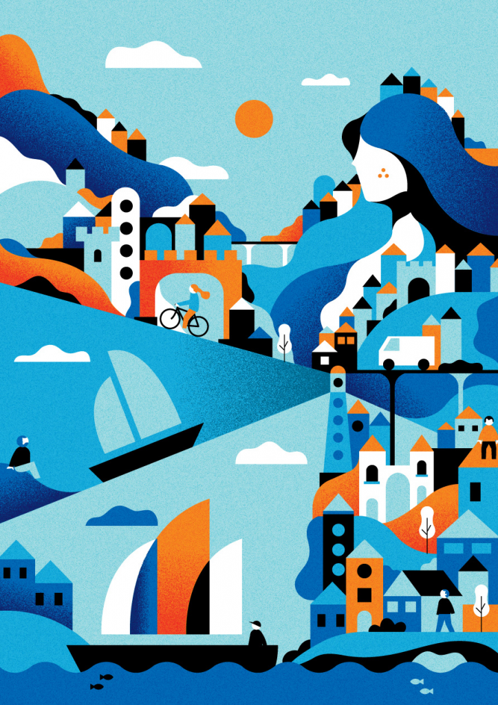
Below is an example of how a movement can be brought into the canvas with a vibrant color palette. There are hardly three colors that dominate the below image, but the balance between them helps the user connect with the graphic in every inch of it.
Black background with numerous popup colors create a thirst to have a peek at the design
Blue/purple combination: The color of the year
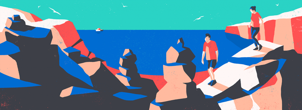
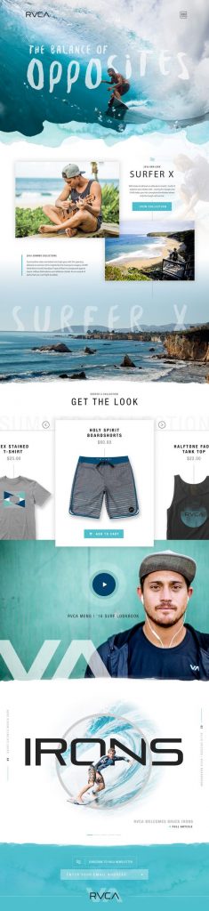
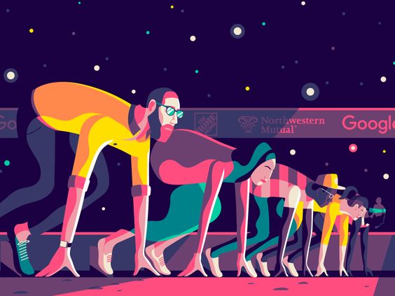
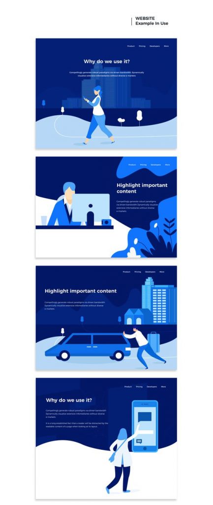
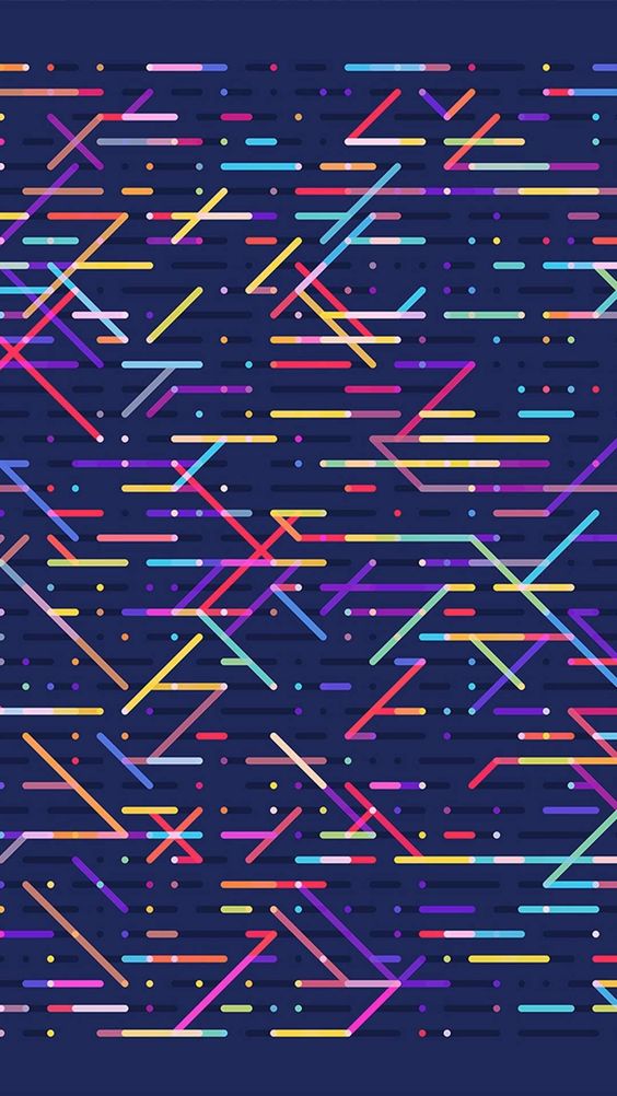
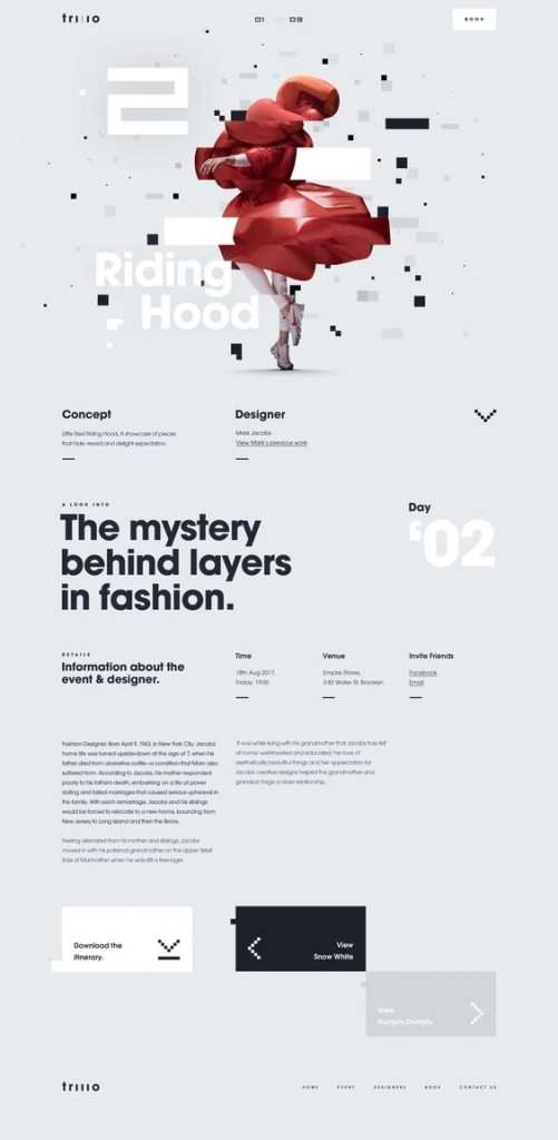
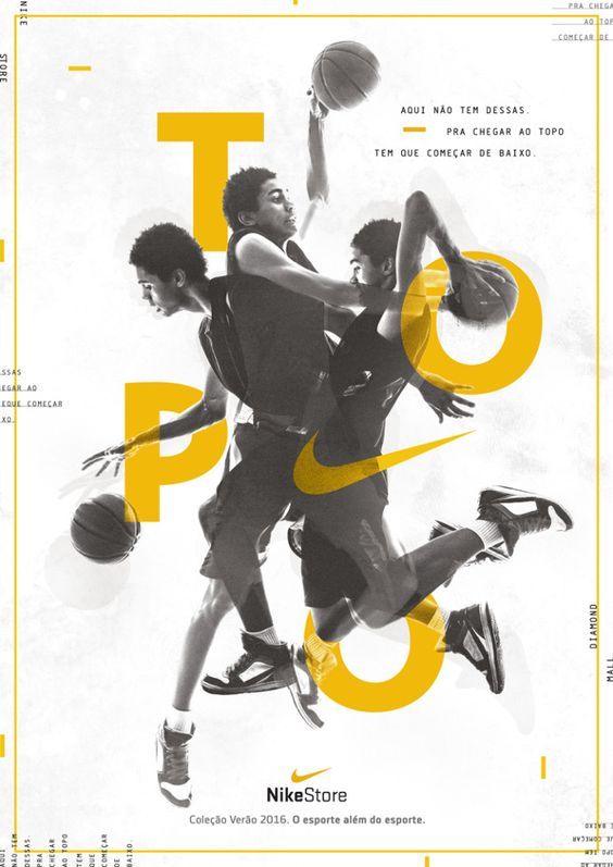
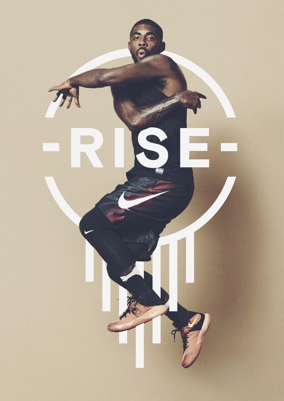
Asymmetrical layouts. Layouts with no continuous pattern
Asymmetrical layouts are predicted to be one of the top designing trends in 2019, as all designers are looking forward to deliver scattered layouts which builds the curiosity to scroll further.
Designers currently are facing a big challenge as there are multiple page builders that offer a clean professional website template which is grid based. So rethinking the new way, designers have started designing websites that don’t fit a grid and flow seamlessly throughout the layout. This makes the user wonder what information is going to pop-up or what animation is going to come up next. Isn’t that cool?
Highlighted below are few examples of asymmetrical layouts that tend to demand attention than normal symmetrical layouts.
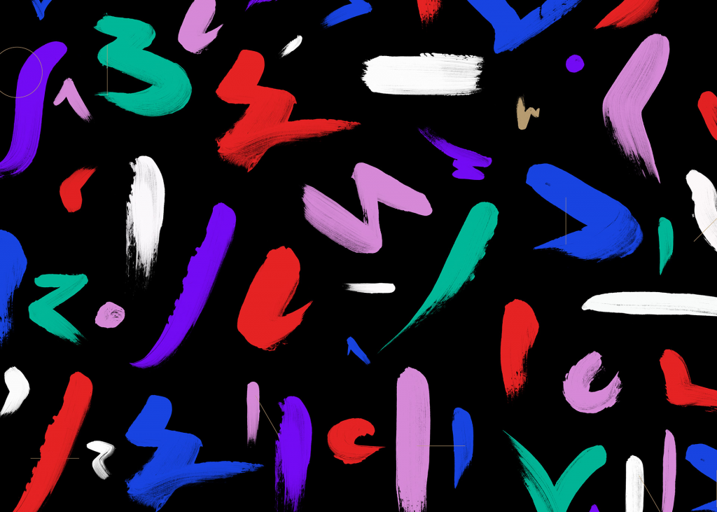
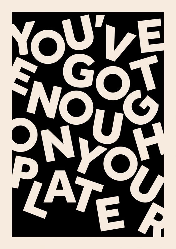
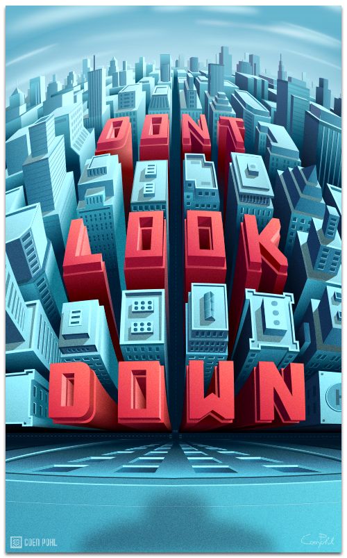
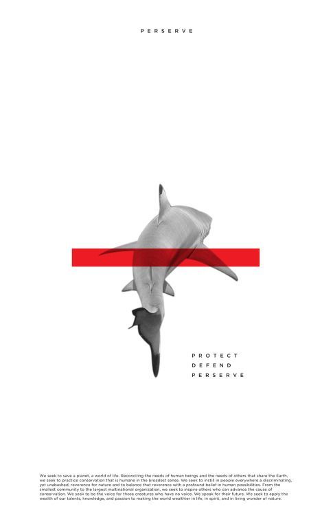
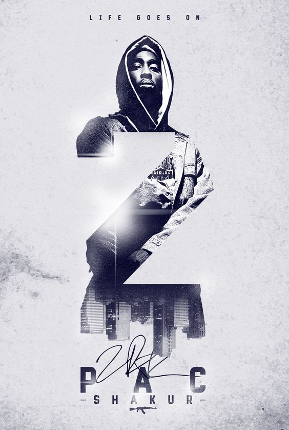
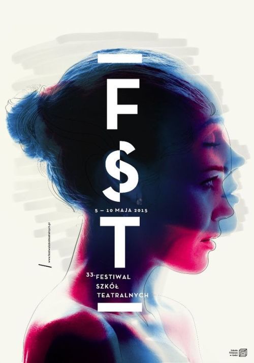
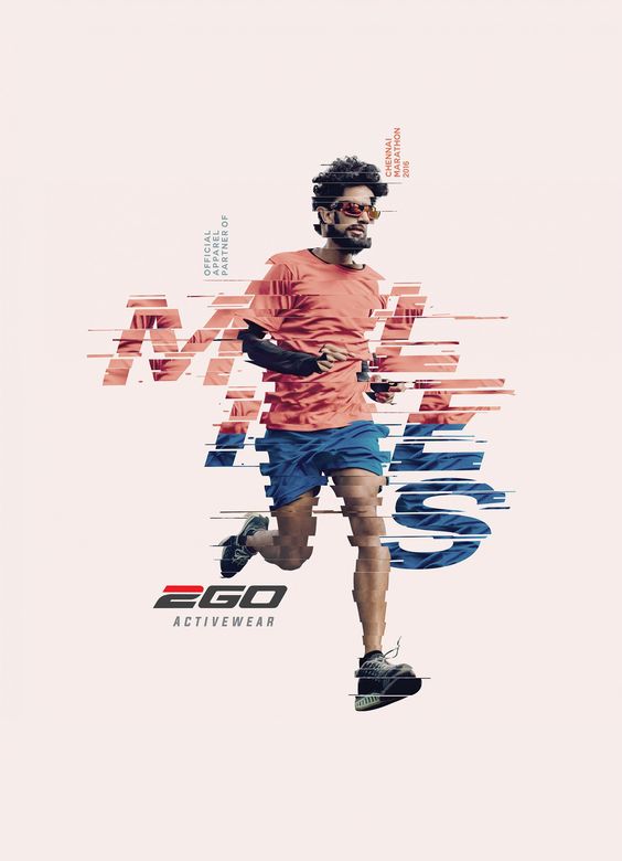
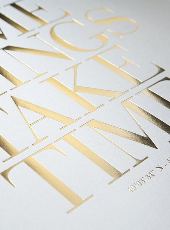
Creative typography
Creativity is just not limited to vibrant designs and unusual combination of colors. Typographies also claim a very unique position in getting that creative touch from a designer.
Be it a poster, a header in a website banner, a simple advert – a
creatively designed typography is all it needs sometimes to deliver the message it needs to convey. Designers have tried to put together different color combinations, patterns, distortions, line strokes, glows and what not to make their text pop up.
Below are few examples of popping up typography. Have a look at each of the design. These are small samples of what typography can deliver when they stand alone. This is the main area where a designer can show their expertise as it is a small piece of art that shows the creativity that fuels up their brain.
So, get experimenting and create new ideas. With the kind of trend now, sky is the only limit.
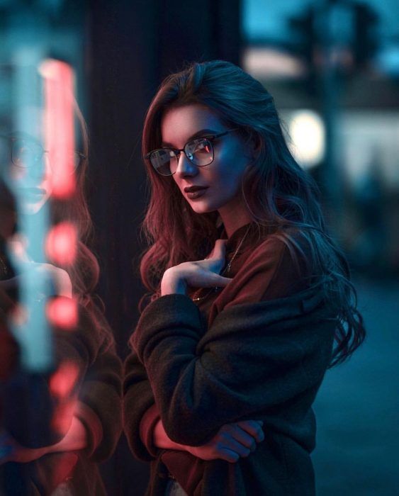
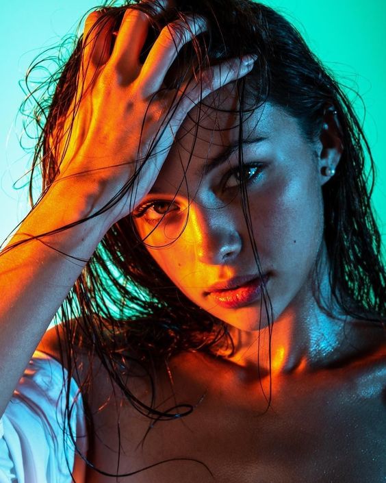
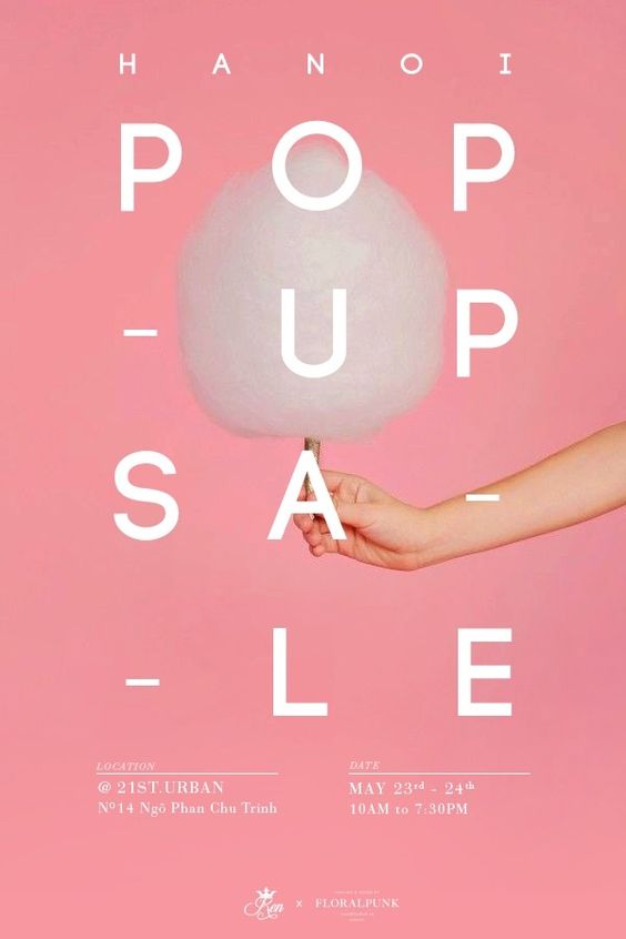
Bold colors, colored fonts, photography based on moods
Bold colors dominated the design industry in 2018. Designers enjoyed the freedom of mixing multiple colors to get their dream output. This trend is expected to continue in 2019. Using bold colors helps designers to experiment with typography, layout and the palette.
Bold colors paired with a correct font family and a balanced layout makes way for a creative and a professional looking website. Bold colors not only are part of creating websites but also play a good role in digital advertisements, print stationary, and social media images.
The hand of designers are becoming essential even in social media to attract that highly volatile crowd. Creating a social media post with bold colors tend to attract the user more than a normal flat white image. (Really??)
Designers have also tried to adapt to a color palette according to the mood of the websites/ design material. Creating a warmth or a soft touch to images or photography has become a trend. These images take us way back to our 1980’s to give that vibe that no neon colors can render. The quality if these images are stunning that designers have got more attraction towards it and they tend to create more such creative piece of art.
Moody schemes are not only in photography but also in websites and graphic designs. Designers can decide the palette based on what mood they want to deliver to the user. Using sharp colors work for fashion and warm colors for the spa as an example, helps the user connect with the business just by seeing it in the first place.
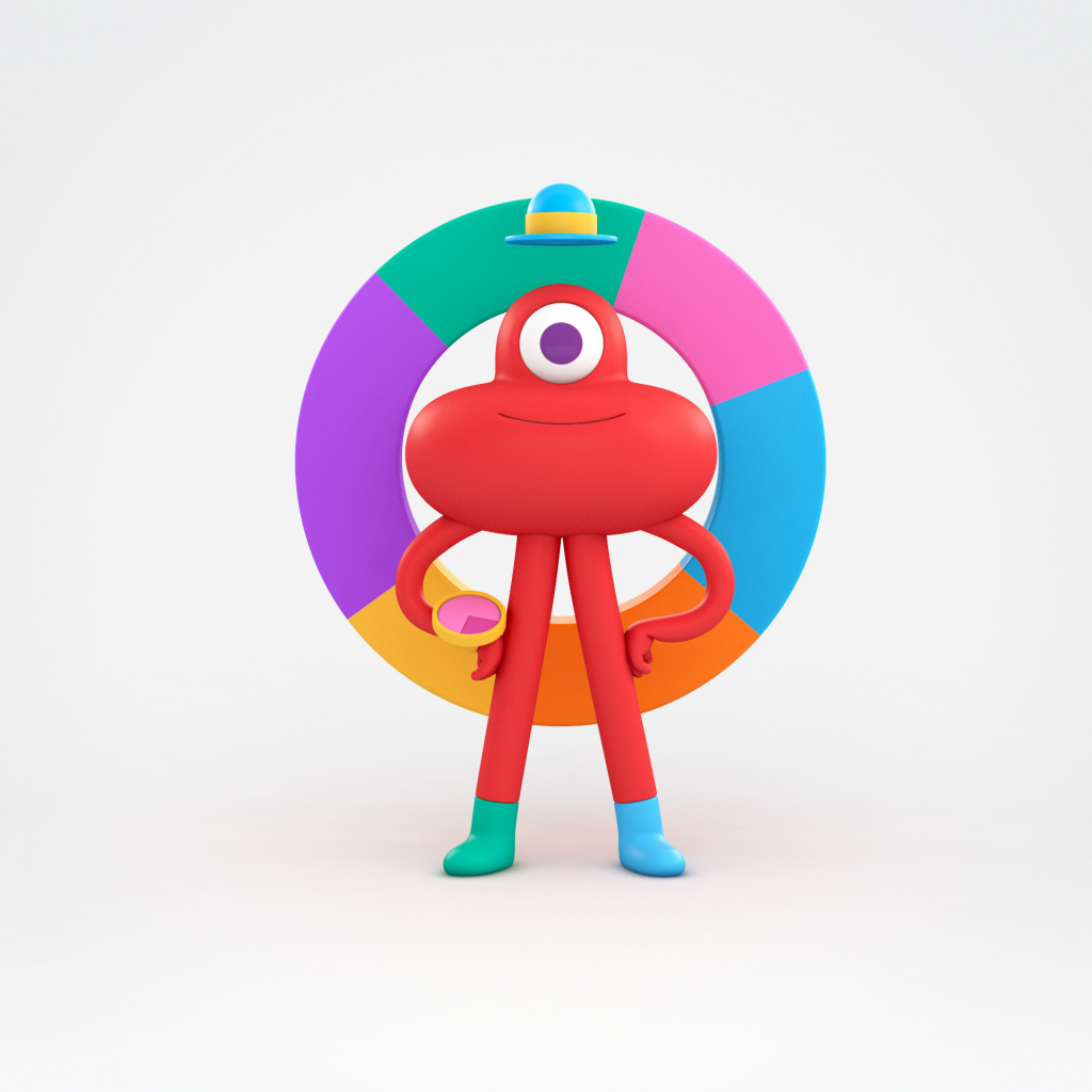
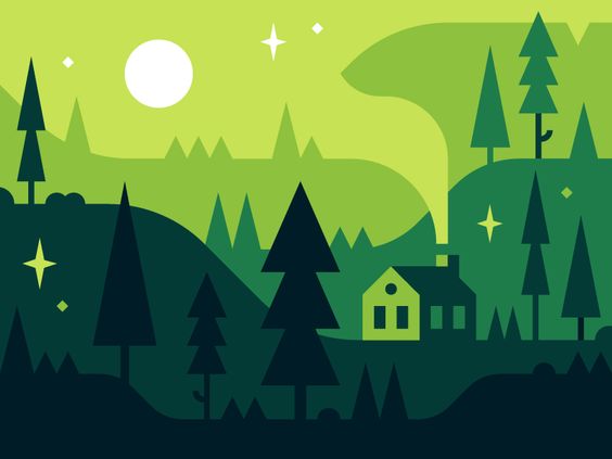
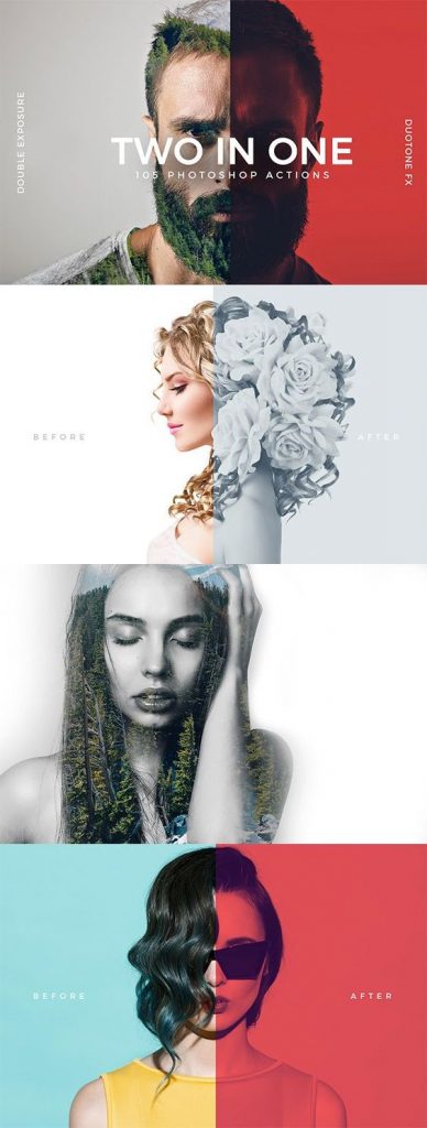
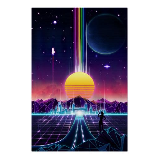
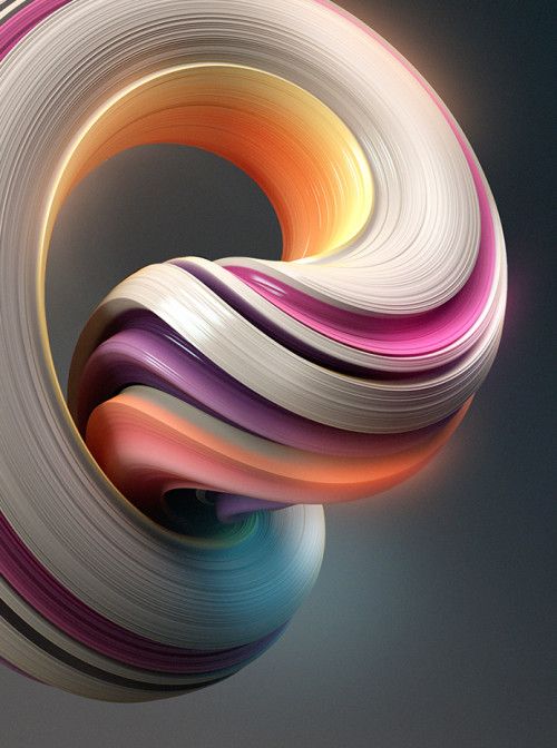
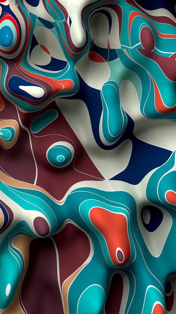
Duotones, seamless gradients, and fluid designs
We have already highlighted in 2017 that duotones will dominate in 2018. These shades have brought a new perspective to photography and design. This will continue in 2019. Designers first started experimenting with duotones in photographs and have now extended the same to illustrations and much more. These kinds of designs bring freshness into the design and help the user connect with the fun element with the brand.
However, we feel that it is a bit overused and frequent in the designs. We will have to wait and see what interesting twists the community brings in with duotones.
Gradients were replaced by flat design in the past, the reasons being gradients were complex and were risky in print designs. The flat design grew rapidly and started ruling the design industry. Now gradients have started to come back and these are being used in very intelligent combinations. Below are few examples to showcase seamless gradients in graphic design.
Fluid designs are also gaining traction in the industry. These are much used in backgrounds, animations, moving graphics to improve user experience and to create a movement in the graphic. Below are a few examples of some interesting fluid designs.
Minimalism – a new way, strokes, splashes, doodles, stains, shapes
Minimum is maximum. Minimalistic designs have always had their place in
professional graphic design. It’s always considered sophisticated and intelligent to deliver the desired message with minimal design.
Even minimalism has taken an interesting turn when used in graphic design. Designers have started adding interesting elements like strokes, splashes, detailed doodles and shapes to spice up the minimalistic design. One such example is the memphis design. These small pieces of minimal art intrigue the user and one can enjoy the royal feel of minimalism in the design.
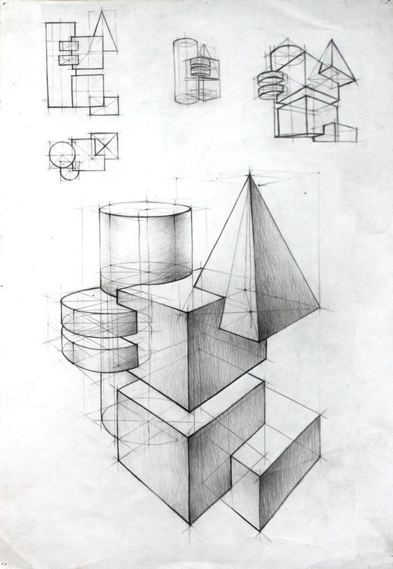
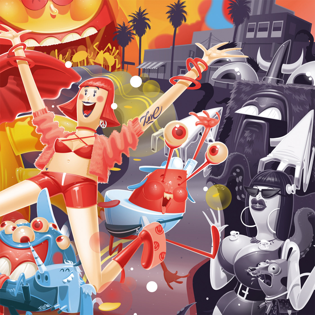
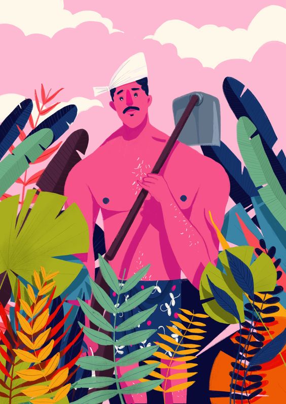
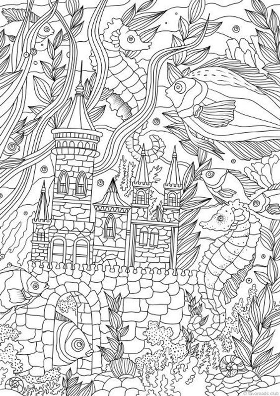
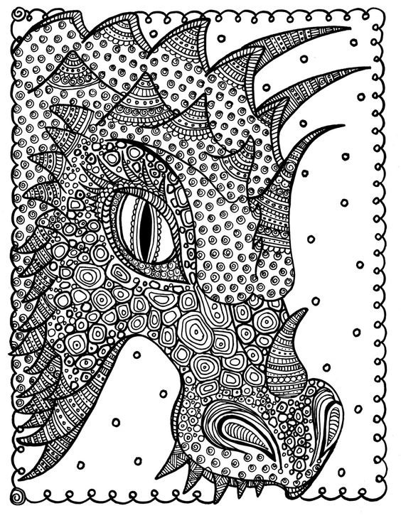
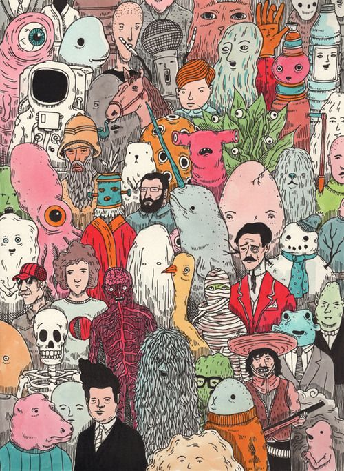
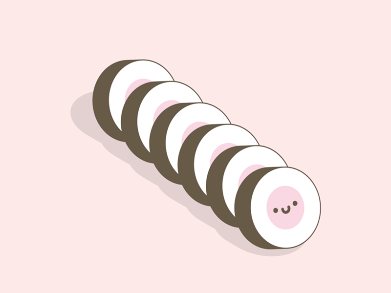
Complicated hand drawn illustrations
Hand drawn illustrations are always in demand. Thanks to the drawing gadgets like Apple pencil, stylus, wacom and much more that are available in the market, that has unleashed the more
creative side of the designers.
More detailed illustrations are emerging and are used in various places where a story needs to be conveyed. Doodling is also an interesting form of drawing that’s getting popular. Below are a few examples of all the ones we discussed in this section.
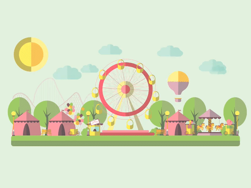
More animated SVGs
Animated SVG’s are in trend for some time now. SVGs are Scalable Vector Graphics that can be scaled to any size right from mobile screen to HD screen. Designers have started to try various animation techniques with these SVGs to bring unique user experience to their users. SVGs are used in website banners, advertisements and much more to attract the user.
Following are a few examples of animated svgs that will give you a good idea of what little animations can bring in terms of graphic design. All it needs is a clear storyboard and a clear vision on the message that needs to be delivered to the user.
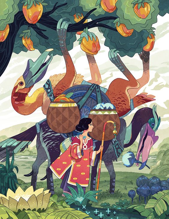
Creative photography, distorted effects in images will gain popularity
Photography is a separate topic by itself and photography trends are so unique and so vast to discuss in a small blog like this. We will just cover how photography trends will influence the graphic design industry in 2019.
Images/photographs are used in websites and landing pages for better user experience and visual treat. The emergence of a lot of stock imagery somehow helped the community with custom photographs that are necessary for the business. But now, stock images are losing its importance as these have become more repetitive. Images like the below have been used in various places and are losing its popularity. So designers have decided to go with photographs or imagery that are actually clicked/edited for the specific need.
Below are the few trending photography techniques that might become more popular in 2019.Have a look and get inspired.
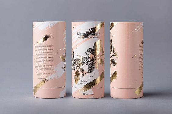
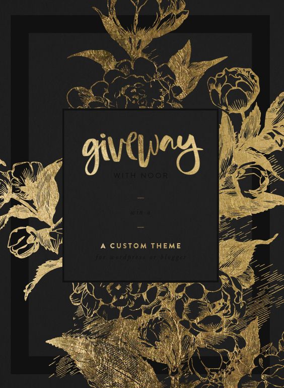
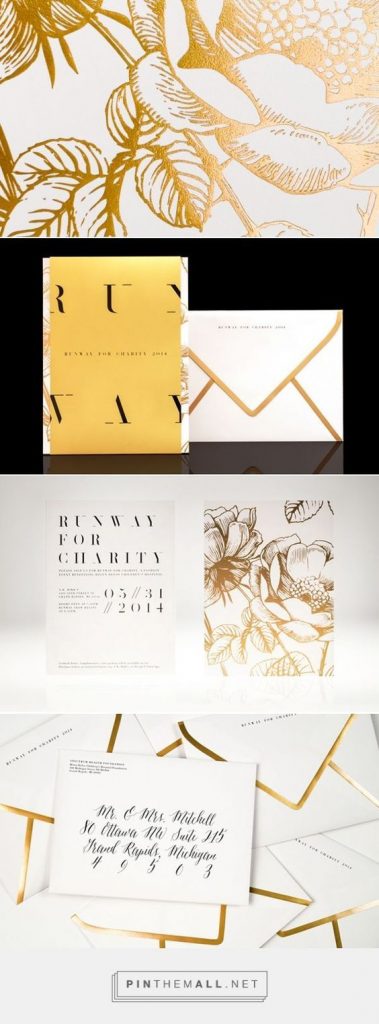
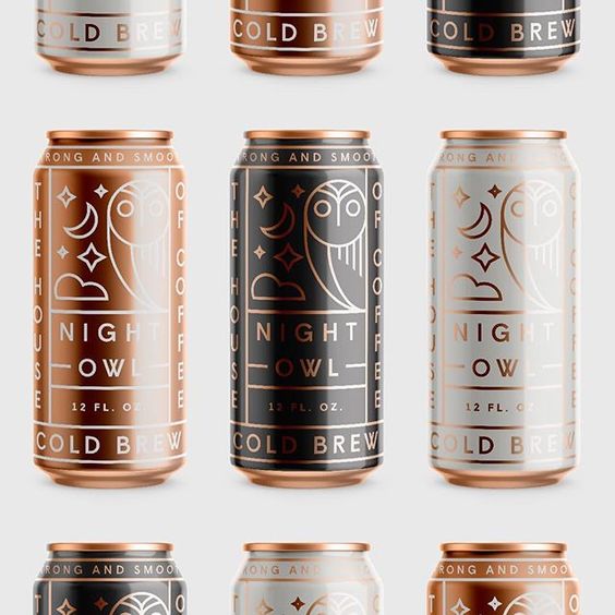
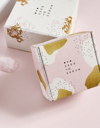
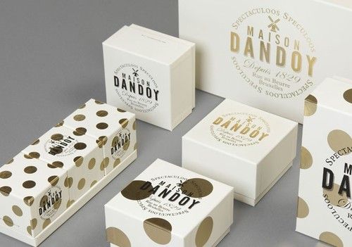
Metallics
Metallics are gaining popularity nowadays. Metallic colors bring that lustrous and royal feel to the canvas they are used in. In 2019, we can see a lot of metallic colors not only on digital canvas but also in print designs.
Gold never goes out of trend, but this time, it’s going to be silver, copper, rose gold and what not in this list to make your eyes gleam. The classic silver or gold combination on black will gain more popularity along with all other metallic combinations that are possible and is going to rule the packaging industry and the digital industry as well.
Below are a few classic examples of metallics. Have a look and get inspired for your next design project.
Other useful graphic design resources:
Key notes:
Conclusion
The above trends are merely just predictions based on the likes and dislikes of user behavior. The graphic design industry is similar to the fashion industry, trends of one year will be outdated the next year and vice versa.