THE TOP 10 DESIGN MISTAKES TO AVOID AND WHAT TO DO INSTEAD
The visual aspect of your brand identity, so anything design related you’re showing to your potential clients is the core of the first impression. You don’t want to turn people off your blog or instantly through away your business card. Well-designed website and brand identity will help you get more clients, customers, email subscribers, followers and more.
MISTAKE 1 – BLURRY, LOW-QUALITY PHOTOS AND GRAPHICS
When you use images and graphics on your website, in your promotional materials or in social media posts, don’t choose low-quality images with low resolution. Don’t waste your money on low-quality graphics and use proper program for creating your website graphics.

WHAT TO DO INSTEAD?
Make sure to choose high resolution and quality images, so even if you resize them, they would still look sharp. If you take your own images, take them near the huge source of natural light, use a tripod, chose consistent, not busy backgrounds.
If you design your own graphics, use Adobe Illustrator, because it creates vector-based graphics, which you can resize and reuse for other purposes. For example, if you design a logo in Photoshop or Canvas at 500x500px canvas, you won’t be able to resize it to 2000×2000 without it looking all blurry.

MISTAKE 2 – SCALING TEXT OR IMAGES DISPROPORTIONATELY
Probably the most dreadful design mistake, sorry but as a designer, I just can’t stand it! You’ve probably seen it more than once on someone’s website or even on a billboard in your city. What does it mean? It’s changing the height (or width) more than the width (or height), so the image is disproportionate.
WHAT TO DO INSTEAD?
When you scale graphics, text or images hold SHIFT and it’ll proportionately resize your design.
MISTAKE 3 – INAPPROPRIATE DESIGN FOR TYPE OF BLOG/BUSINESS
When creating a brand identity for the business, sometimes we forgot why is it for, what is our target audience, what’s our signature style we’d like to show through design. The huge mistake is to use inappropriate design elements like photography, graphics, fonts and colours.

WHAT TO DO INSTEAD?
For example, if you’re a wedding dress designer, your target market are women who want to get married, so you’d use colours, light graphics, romantic photos, script or sans serif fonts appealing to women, not masculine, sport-style or gothic style fonts and dark images.

MISTAKE 4 – USING HARD TO READ FONTS
If you’re searching for a blog post on Pinterest, the first thing you see is sticking, bold and large text on the vertical image. If someone if using hard to read fonts, you probably scroll further. Who doesn’t love script fonts? But they have to be used carefully. Another dreadful design mistake is to use capitalized script fonts – sometimes is impossible to read them, no matter how awesome your blog post is.

WHAT TO DO INSTEAD?
Use mainly sans serif fonts (serif are also fine, but harder to read) on your website and on your images (especially blog post images!) and if you use a script or handwritten fonts, use them on a small portion of your design. If you use them, please use Title Case or all lowercase.

MISTAKE 5 – NOT USING PARAGRAPHS
Writing long, high-quality and valuable blog posts helps you rank higher in Google, get more repins on Pinterest, gain traffic and loyal followers. But if you write a blog post, no matter how long it is, you should use paragraphs to make it more pleasing to your reader’s eyes.

WHAT TO DO INSTEAD?
Let’s be honest – images are much more appealing than text, so to make it more approachable, use paragraphs, headings, empty space and dividers in your blog post images

MISTAKE 6 – TOO MANY COLOURS & CLASHING COLOURS
Who doesn’t love colours?! Colours takes a huge part in the design, but it’s easy to overuse them. Although is all right to have multiple shades of colours in your brand design (especially for blog post images with a solid background like mine), having too many different colours is just distracting and decreases your chances that someone would remember you. Also avoid colours that clash, because when you use them for example in your blog post images, they are simply impossible to read.
Don't use clashing colours, they are simply impossible to read.
Avoid colours that don't fit well together. Look at your colour theory models
see link
Don't forget about using contrasting colours. It's impossible to read it.

WHAT TO DO INSTEAD?
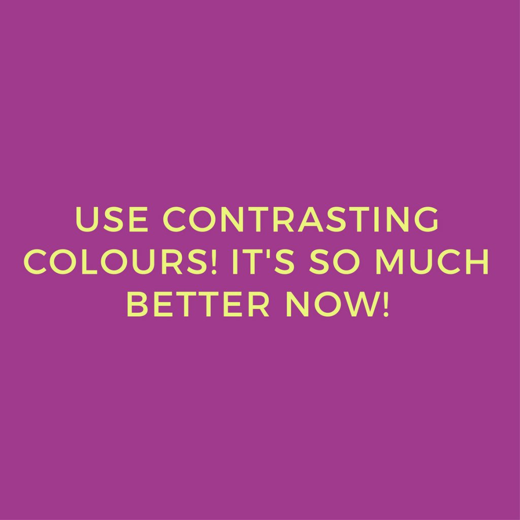
Keep it simple, try to use no more than two different colours in your text and no more than three colours in your images. Choose colours that complement each other or fit together, so don’t use gold and silver together. If you create graphics with a solid background and text, use contrasting colours so the text is visible.
Use colours that fit well together
Use contrasting colours. It's so much better now.


MISTAKE 7 – TOO MANY FONTS
Similar to colour usage, don’t use too many fonts on your website, logo or other designs. You shouldn’t use more than 2-3 fonts if you use too many fonts, your brand seems incohisive, unprofessional and busy. Not to mentioned that, when you have too many fonts, you distract your visitors, because their eyes have a hard time scanning multiple typefaces.

WHAT TO DO INSTEAD?
Use no more than 2-3 fonts, have a main font and a secondary font. Choose the fonts that will fit all your design needs.

MISTAKE 8 – CENTRE-ALIGNED TEXT EVERYWHERE
While is all right to sometimes use centre aligned text on your headings or short text, it’s a huge mistake to use it everywhere on your website. Why? Centred text is just difficult to read, not to mentioned it look sloppy and unprofessional. This forces your readers to find where each line of text starts since there’s no consistent starting place.

WHAT TO DO INSTEAD?
Use right or left aligned text. Make your visitors experience on your blog much more appealing and less frustrating.

Don't forget about using contrasting colours. It's impossible to read it.

WHAT TO DO INSTEAD?
Keep it simple, try to use no more than two different colours in your text and no more than three colours in your images. Choose colours that complement each other or fit together, so don’t use gold and silver together. If you create graphics with a solid background and text, use contrasting colours so the text is visible.
Use colours that fit well together
Use contrasting colours. It's so much better now.

MISTAKE 7 – TOO MANY FONTS
Similar to colour usage, don’t use too many fonts on your website, logo or other designs. You shouldn’t use more than 2-3 fonts if you use too many fonts, your brand seems incohisive, unprofessional and busy. Not to mentioned that, when you have too many fonts, you distract your visitors, because their eyes have a hard time scanning multiple typefaces.

WHAT TO DO INSTEAD?
Use no more than 2-3 fonts, have a main font and a secondary font. Choose the fonts that will fit all your design needs.

MISTAKE 8 – CENTRE-ALIGNED TEXT EVERYWHERE
While is all right to sometimes use centre aligned text on your headings or short text, it’s a huge mistake to use it everywhere on your website. Why? Centred text is just difficult to read, not to mentioned it look sloppy and unprofessional. This forces your readers to find where each line of text starts since there’s no consistent starting place.

WHAT TO DO INSTEAD?
Use right or left aligned text. Make your visitors experience on your blog much more appealing and less frustrating.

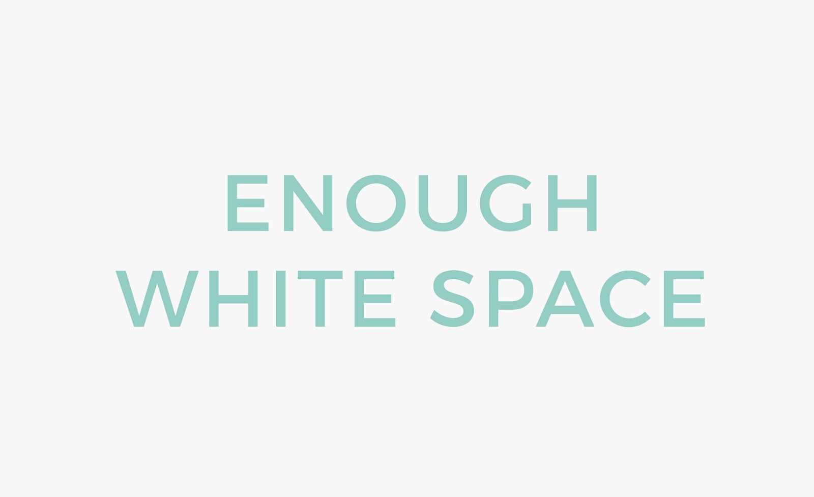
MISTAKE 9 – NOT ENOUGH WHITE SPACE (NEGATIVE SPACE)
Don’t just place all the elements in one place of the image and don’t fill the canvas all the way to the edges. The term “white space” (or negative space) doesn’t necessarily mean that the background should be white – it’s just a design term and practically speaking is about leaving a blank space.

WHAT TO DO INSTEAD?
Having a place to breath in your design or photography can make it so much better and pleasing to the eyes.
MISTAKE 10 – POOR KERNING (SPACES BETWEEN LETTERS)
Kerning is a design term to the spacing between two letters. Poor kerning is usually common with low-quality fonts. If two letters are too close together, it can make words look messy, unclear and difficult to read.

WHAT TO DO INSTEAD?
Try fonts before you buy them, check if they have equal spaces between letters. If you’re downloading free fonts, use tested websites like Google Fonts, Da font etc. It doesn’t apply to handwritten fonts – they supposed to look like someone hand written them, so they don’t have to be perfect.

When you making those design mistakes, you’re decreasing your chances of making a good first impression. Nobody wants to look unprofessional, amateur, inconsistent and as you can see – none of the top design mistakes is related to your personal taste, it’s related to design principles. Without good design, even the best, most valuable content gets lost in the mix.
LET’S RECAP:
1. BLURRY, LOW-QUALITY PHOTOS AND GRAPHICS
Use high resolution and quality images. If you take your own images natural light is your friend. When designing graphics – use Adobe Illustrator or other vector based program.
2. SCALING TEXT OR IMAGES DISPROPORTIONATELY
When you scale graphics, text or images hold SHIFT and it’ll proportionately resize your design.
3. INAPPROPRIATE DESIGN FOR TYPE OF BLOG/BUSINESS
Keep in mind your target audience and your personal style when you choose graphics, photos, colours or fonts for your business or/and blog.
4. USING HARD TO READ FONTS
Sans serif fonts are your friend! Don’t use capitalised script or handwritten fonts.
5. NOT USING PARAGRAPHS
Use paragraphs, headings, empty space and dividers in your blog post images
6. TOO MANY COLOURS & CLASHING COLOURS
Try to use no more than two different colours in your text and no more than three colours in your images. Also, avoid colours that don’t fit together, use contrasting colours.
7. TOO MANY FONTS
Use no more than 2-3 fonts, have a main font and a secondary font. Choose the fonts that will fit all your design needs.
8. CENTRE ALIGNED TEXT EVERYWHERE
Use right or left the aligned text for a large portion of your content.
9. NOT ENOUGH WHITE SPACE (NEGATIVE SPACE)
Having a place to breath in your design or photography can make it so much better and pleasing to the eyes.
10. POOR KERNING (SPACES BETWEEN LETTERS)
Use fonts that have equal spaces between letters.