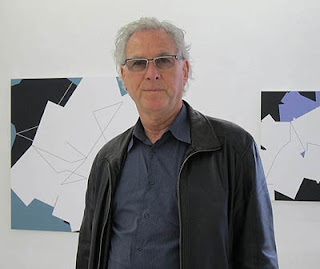
| Give examples of how formal elements and principles of: • BalanceBalance is the distribution of the visual weight of objects, colors, texture, and space. If the design was a scale, these elements should be balanced to make a design feel stable. In symmetrical balance, the elements used on one side of the design are similar to those on the other side; in asymmetrical balance, the sides are different but still look balanced. In radial balance, the elements are arranged around a central point and may be similar.
|
Wednesday, July 6, 2016
Develop Design Principles and Techniques and Processes for Designing Products
Develop Design Principles and Techniques and Processes for Designing Products
Subscribe to:
Post Comments (Atom)
Featured Post
Computers in Art Practice:Manfred Mohr
Artist Manfred Mohr Since 1969, Manfred Mohr has used computers and plotters as electronic and digital drawing aids, thus making inevita...

-
Able to understand why a design brief is critical to the design process Explain the purpose of a design brief The design ...
-
Principles of marketing and evaluation 1 .1 explain the importance of defining market segments to the developm...
-
What is a sales funnel? A sales funnel is a visual representation of the steps required to sell your products or services. A sales funnel s...
-
How to Create Effective Marketing Campaigns by Sam Ashe-Edmunds Related Articles 1 Top Ten Promotional Strategies 2 How to I...
-
Develop Design Principles and Techniques and Processes for Designing Products Give examples of how formal elements and principles of...
-
Adobe Illustrator is the perfect tool for creating abstract art with basic shapes and lines. In today’s tutorial I’ll show you how to creat...
-
Understand the formal elements and principles of design Give examples of how formal elements and principle...
-
This is the ability to use IT tools and devices for collaborative working and communications, such as web or video conferencing, instant me...
-
Understand how to organise and evaluate data that has been researched. 1.1 describe purpose and benefits of organising data so that it c...
-
Personal and professional development Einstein stressed that lifelong learning should be a focus because personal growth stops whe...


No comments:
Post a Comment
Note: Only a member of this blog may post a comment.