13 tips for designing modern characters
Whether designing for 2D, editorial, ad campaigns or games, adopting a mindful approach to character design is essential to fit with the changing times we live in. Understanding your audience, crafting a compelling story and knowing the limitations and possibilities of the diverse range of media platforms available can only open up the scope of possibilities for today’s character designers.
But how best to do so? We spoke to top designers and illustrators to discover how they create modern and vibrant characters that will stand the test of time.
01. Let your characters represent you
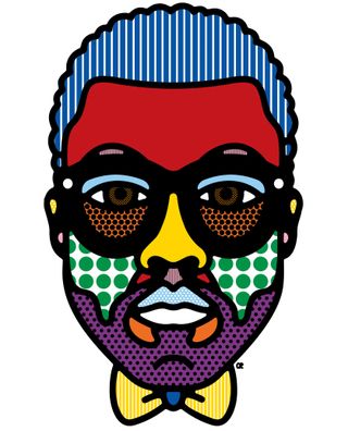
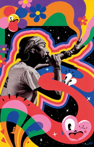
Craig & Karl's portrait of Kanye West
Characters are frequently representative of their creators, observes Craig Redman, one half of design studio Craig & Karl, through both the visual style as well as how their personality shines through.
"For us it’s the relationship to the creator that makes it interesting. We tend to think of Craig & Karl as a conversation or continual back and forth between the two of us, which is how we operate day-to-day too,” adds Karl Maier (the other half of the creative duo). “As it’s only the two of us, our personalities, backgrounds and interests all feed into the work we make. And as much as there’s a visual style, we aim to bring our perspective to things so there’s a consistent tone or approach, even if the form varies.”
02. Set parameters
Depending on the variables, such as the intended audience, the purpose of the work and where it’s likely to live – as well as whether you’re a visual designer, illustrator or game developer – figuring out a basic framework early on in the process will help inform your characters and add another layer of depth to their purpose.
“Concept is key, it’s the foundation for what we’ll build an idea of narrative around.” says Maier. “All of our projects begin by having a conversation to figure out the basic framework for what we want to say and how we’d like to do it. Sketching plays a role too, but usually, it’s more like a note-taking process that lets us get ideas down quickly and allow things to gestate, as opposed to a blueprint that we’ll then work over to create the final piece.
"We do like to get a relatively clear notion of what we want the outcome to be before diving in,” continues Maier. “From there, it’s all about the doing and making, trial and error, love and loathe, back and forth process that we go through.”
03. Create a narrative

An illustration by Rilla Alexander for A Bear Sat on the Porch Today
Character design is frequently driven by story, and that remains true no matter which platform characters are intended for. Whether crafting characters for print media, advertising campaigns or animation, giving your characters a purpose strengthens their reason for being.
Australian born, Berlin-based illustrator Rilla Alexander explains. “When I am illustrating a book that someone else wrote, I see the characters as actors on a stage who have to get into character, whereas when I am working on my own stories, I see the characters as embodying their own emotions. You shouldn’t be conscious that a good actor is acting and so I would hope that distinction is not obvious to anyone else… but it’s what is going on in my head.”
Illustrator Jim Stoten agrees: “You can appeal to personality traits that exist within an audience. I really like how expressive hands are. You can communicate a lot about a character by how they hold a glass or the way they sit. It’s a way of showing a character’s personality.”
04. Inject a personality
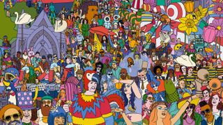
Artwork for Where's My Welly?: The World's Greatest Music Festival Challenge, illustrated by Jim Stoten
Stoten, whose vast, intricate landscapes are filled with tuba-playing elephants, dancing robots and crocodiles eating ice cream, has an interesting view of his characters; “I think to a certain extent characters that I create are self portraits,” he explains. “Either they have mannerisms or traits of mine, or have things about other people that I admire built into them.
“Personally, I like characters that have elements of their personalities visualised in their physical appearance somehow,” he continues. “Mr. Tweed, my children’s book character, was based almost entirely on Peter Ustinov. I watch a lot of old talk shows while I am working, and Peter Ustinov was such an amazing character, both physically and in the way he conducted himself.
05. Harness comedy
Nexus Studios' Hotstepper character was deliberately made to be comical
”A sense of humour is key, says Maier. “I think that regardless of the form a character takes, there’s inevitably something human, something of us in them. It’s a little like holding a comical mirror up that highlights the humour, absurdity or difficulties of our lives,” he says, “and because they tend to be cute or exaggerated visually, they can tackle ideas or situations with a lightness that might be harder otherwise."
The importance of comedy is especially true of interactive work, whether you’re playing with the characters, taking control of the character or following them around. Nexus Studios designed the look and feel of HotStepper, the world’s first augmented reality character-based wayfinding app, centred around an irrepressible character inspired by internet culture, Friedrich Liechtenstein’s ‘Supergeil’ and Napoleon Dynamite’s infamous dance moves, synth pop vibes and British eccentricity.
“An enigmatic character is hugely important if they are the protagonist in your narrative,” advises Alex Jenkins, a director at Los Angeles and London-based Nexus Studios. “You want the audience to root for the characters you’ve breathed life into, make an emotional connection and participate. With interactive work you have to provoke the audience to get involved, you can’t passively watch it unfold like in film.”
07. Use universal themes
Advertisement
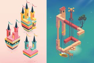
Monument Valley 2 is known for its striking visuals and magical architecture
Speaking on stage at OFFSET Dublin, ustwo games head of studio Dan Gray spoke about crafting a story inspired by universal themes when creating Monument Valley 2. “A challenge we have in the mobile space [is that] it’s very difficult to keep people’s attention. They’re opening a game for 30 secs or a minute at a time before moving on to the next thing. So it was very important to us that we surprised people at every turn.”
The award-winning sequel to Monument Valley follows a mother-child narrative, as they embark on a journey of discovery through a stunning and impossible world. “It’s a very rare duo to see in gaming these days” says Gray. “We didn’t want the mother to seem overbearing or a burden; but empower her. We purposefully didn’t define the gender of these characters.”
Making a mother the central protagonist in a game is a unique and striking approach to game design. “We must have gone through over 200 characters trying to get the feeling right,” Gray admits.
08. Get the right proportions
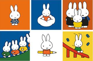
"You can reduce Miffy down to her eyes and that distinctive cross nose and still know it is her," says Rilla Alexander
Visually, the proportions of a character can also make a notable difference. Jenkins says: “I’ve always been a fan of the Japanese approach to characters. I love the simplicity of how they capture really strong emotion with quite minimal detail, just well-placed eyes and mouths and the use of exaggeration.”
Advertisement
Jenkins thinks that if you have a character with little expression, moving it into the body is the best way to “carry the personality and express emotion.” It’s a sentiment shared by Alexander, who believes that every character should have one distinctive characteristic that is crucial to their very being. “You should be able to gradually remove each feature one by one until you are left with one or two features that you can still clearly recognise them by,” she says. “Miffy is a very good example of this – you can reduce her down to her eyes and that distinctive cross nose and still know it is her. You don’t even need her rabbit ears!”
“There are a lot of basic design principles regarding composition and proportion that apply to character design,” says Alexander. “It might seem obvious, but the more cute and round a character, the more approachable and naive they seem. The more angular a character, the smarter they appear. All of these things are at play when I am working, whether I am conscious of them or not.”
09. Make your characters relatable
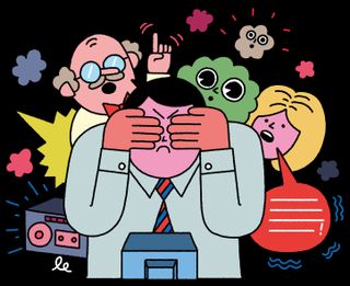
Swiss Referendum, Republic, by Leon Edler
For Alexander, giving life to new characters can be an intuitive process, and one that has been honed and developed through her numerous professional and personal projects. Her alter-ego Sozi stars in her self-authored picture books Her Idea and The Best Book in the World . “Sozi is a way for me to express what are sometimes quite complex emotions in a simplified way,” she reveals. “When I was procrastinating about my first book, it was Sozi and her struggle to finish her ideas that I wrote about. Looking back I can see it was the book I had to do, before I could get over that mental hurdle and start making books about other things.
“Characters might come to me as a clear visual but I have to dig to figure out who they are,” she continues. “There are others that I only initially know from the inside – their personality or their story – and then the challenge is to work out what that character should look like from the outside. I nearly always find that the character’s personality or looks remind me of an aspect of someone I know. That moment of connection is the very thing that makes me want to keep drawing or writing and to discover more.”
Advertisement
If your characters come from an honest, real place they will be more relatable to your intended audienceHattie Stewart
Balancing elements and defining the characteristics is especially relevant in publishing, where editorial illustrators must adhere to strict deadlines – a couple of hours in some cases. For Brighton-based illustrator Leon Edler, crafting genuine characters is a skill in itself. “When I started out, art directors would ask me to make the characters in my finals closer to the original sketch. When I’d done the original sketch, all I was thinking about was that character and the concept,” he says.
It’s important to make sure that the final artwork isn’t too polished, as there is a risk that the characters will be less engaging. “I think if the characters are relatable, people will often look past the style of the work more than they do with traditional illustration,” he concludes.
If your characters come from an honest, real place they will be more relatable to your intended audience, says London-based illustrator Hattie Stewart. “Inevitably your work reflects some part of your character, so yes my characters are a reflection of myself, or at least how I would hope myself to be.”
10. Adapt for your audience
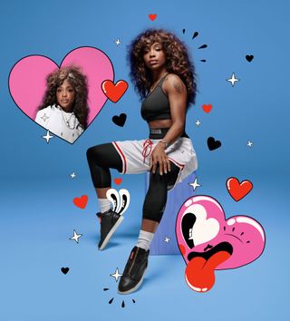
A campaign for Nike by Hattie Stewart drew upon her signature style
Best known for ‘doodlebombing’ over influential magazines, Stewart’s tongue-in-cheek artwork moves fluidly between many creative fields, including collaborations with fashion brand Henry Holland. “I like to think my work is something every generation can enjoy,” she says. “It evokes childhood feelings with its cartoonish style, but also has themes that are more adult in nature. It’s playful, it’s engaging, it doesn’t take itself too seriously and it’s adaptable.”
Her brightly coloured Posca pen creations first gained notoriety when she began mixing her drawings with photography and they have been featured by the industry’s biggest names. She is a testament to the power of DIY culture, having created her own niche through sheer hard work, practice and gutsy personal projects. “I’m lucky that because I focus solely on my own work people tend to come to me for that, so I rarely feel pushed in directions I feel uncomfortable working in,” she explains.
Approaching each brief with her sketchbook to hand, her starting place is often decorative motifs and symbolism that capture the imagination, combined with a highly expressive face. “I’ll play around with different themes and concepts. I’ll go back to my sketch for underdeveloped ideas that may work in the present. It all comes naturally, and when it works, it works!”
11. Keep diversity in mind
Advertisement
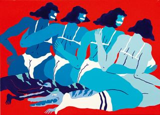
Land of Pleasures by Jose Mendez
Increasingly, today’s creatives are faced with challenges around culture and diversity, because the public quite rightly expect brands and media to recognise the need for inclusivity, and adapt their advertising accordingly. Yet, to do so without resorting to stereotyping can be surprisingly difficult. “It’s important to reflect the times we are living in,” says Spanish illustrator Jose Mendez. “Illustrators should focus on creating characters that represent people, tribes, animals that people can relate to.”
It’s an approach championed by Nexus Studios, a company that prides itself on creating heartfelt stories and experiences that engage audiences through the power of entertainment and culture. “We need more diversity and inclusiveness,” stresses Jenkins. “It has to reach a point where it’s not a ‘thing’ to be mindful of, it’s just life.”
And he has a firm idea of how this can be achieved. “To break stereotypes, diverse characters must not be token team members, they should be in the plot because they matter, have a valid role, are vital to the plot, so why not start from there? Being of mixed heritage I do feel aware and have noticed the somewhat arbitrary way some productions have plugged-in diversity. Yet I think even if handled awkwardly it can be positive, because it brings the issue into focus and helps us overcome biases.”
12. Avoid stereotypes
One of Hattie Stewart's 'doodlebomb' creations
For Craig & Karl, it’s an issue to be acutely aware of. “We are very mindful of diversity in our work and always create a good balance of the sexes and backgrounds in our portraiture. Clients are super aware of the importance too and mostly request it, which is great. We’re doing a project at the moment that involves creating a character for different cities around the world, so when it comes to drawing a girl from Paris (for example), it’s not about drawing Eiffel Tower earrings and giving her a beret, it’s far more interesting and challenging to capture the essence of a real Parisian, someone looking awesome going about their everyday activities. No one wants corny representations of gender, race or sexuality… it’s all about creating an overall vibe.”
“Diversity is incredibly important to me,” enthuses Stewart. “I’ve always said my characters have no ascended gender or race; I want them to be universal but still unique and inclusive. I couldn’t imagine making characters this fun and cheeky and them not being diverse.”
Advertisement
When I started, I nearly always sketched white men... I'm now a lot more mindful at the sketch sketch to mix up the charactersLeon Edler
For Edler, striking a balance is essential. “I had to represent 16 different demographics for the Guardian’s budget coverage last year, so there might have been a tendency to take inspiration from stereotypes, but at the same time we have to be responsible – you don’t want to be reductive.”
Working almost exclusively in editorial illustration for leading publications, Edler admits that it can still be tricky sometimes. “When I started, I nearly always sketched white men in my concepts, and I would be asked to make sure I included women and people of colour in the finals. As I’ve developed and my career has progressed, I’m a lot more mindful at the sketch stage to mix up the characters and represent a bigger range of people.
13. Experiment with new approaches
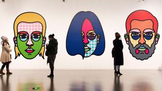
An exhibition of Craig & Karl's portraits in Shanghai
Reducing the characters into simple forms and exaggerating their features gives you more scope to be able to adapt the character into any situation, whether it’s 2D or in the real world through sculpture or products, observes Redman.
“Visually we’re both drawn to bold shapes and colours composed in a high impact and simplified way,” he explains, “and those ideas are translated into our work without us really thinking about it – it’s instinctive.” Adopting the same approach for their portraits, whether they are drawing a public figure or celebrity, Craig & Karl reveals it’s all about singling out a feature that is distinctive to that person.
“In the case of Trump it’s pretty easy, that orange wig/face and glum look; when we’re drawing friends it might be a beard or a particular piece of jewellery that identifies them. Whatever it is, that’s the element to highlight and exaggerate, this allows the viewer to get a quick read and identify who the subject is.” Taking the time simply to experiment and try things out generally across the board is also an essential part of the way the duo work, across different types of projects.
“There’s a sort of flow of ideas where one thing feeds into another all of the time,” reveals Maier. “What we develop as part of one project may spark a thought for a character or vice versa. I guess it acts as a little reset when we come back to character design, which hopefully keeps our approach fresh.”


No comments:
Post a Comment
Note: Only a member of this blog may post a comment.