Project Brief:
This project provides you with the opportunity to produce your own ‘Typographic Bible’; it aims to encourage you to produce research investigations in an ongoing manner, without worrying about producing just one final end result. Each week, each session and each topic could enable you to produce sketchbook experiments which are worthy of being used within your end of year exhibition and your portfolio of work (digital and/or physical). You will be provided with the opportunity to cover a variety of themes during the project and you should self-motivate yourself to investigate, explore and present the suggested topics. This must all be evidenced within your project sketchbook.
Typographers, Designers And Artists
A list of Typographers, designers and artists who may be of interest to you for this project.
Alan Fletcher
Ed Ruscha
Jan Tschichold
Rick Myers
Rudy Vanderlans
Sister Corita
Vaughan Oliver
The Designers Republic
Graphic Thought Facility
Why Not Associates
ICE(MAN) IS BACK?

Butcher Billy - music x comics = cool
Marvel Superheroes re-imagined as '80s punk, post-punk and new wave icons.
Following on from his earlier series of Post-Punk 'Super Friends', illustrator and New Wave obsessive Billy has returned to his favourite theme of dressing up the likes of The Smiths and Joy Division in super suits.'
. . . . . . . . . . . . . . . . . . . . . . . . . . . . . . . . . . . . . . . . . . . . . . . . . . . . . . . . . . . . . . . . . . .
EPISODE I: THE PHANTOM POST

Michal Krasnopolski - a man of simple taste.
He says of his range of poster designs:
Simple and clever. I struggled with the Pulp Fiction image for some reason, but thankfully not with the Jaws one. Thanks to Amy Li for this find (blame her for any related projects ;-)
. . . . . . . . . . . . . . . . . . . . . . . . . . . . . . . . . . . . . . . . . . . . . . . . . . . . . . . . . . . . . . . . . . .
EPISODE II: ATTACK OF THE CRAMPS

James Green - good Prints / good beard.
(In)famous for his Donkeys and views of Sheffield. Did some lovely work with kids for Sheffield Childrens' Hospital.
. . . . . . . . . . . . . . . . . . . . . . . . . . . . . . . . . . . . . . . . . . . . . . . . . . . . . . . . . . . . . . . . . . .
EPISODE III: REVENGE OF THE CLIFF

"Broadsword calling Danny-boy"
This fella has better taste than me and has found some great stuff.
A visual magpie indeed! Thanks Trudi.
http://martinklasch.blogspot.co.uk/
. . . . . . . . . . . . . . . . . . . . . . . . . . . . . . . . . . . . . . . . . . . . . . . . . . . . . . . . . . . . . . . . . . .
EPISODE IV: A NEW BLOG

Kristyna Baczynski - comic illustrator.
Kristyna Baczynski - an illustrator, comic book artist and designer "of Yorkshire tongue and Ukrainian blood" who works from her studio in Leeds.
I particulary liked the above book 'Girls who drwa mythical creatures'.
. . . . . . . . . . . . . . . . . . . . . . . . . . . . . . . . . . . . . . . . . . . . . . . . . . . . . . . . . . . . . . . . . . .
THE BLOG STRIKES BACK

30 abandoned places that look truly beautiful.
Weird and interesting photographs (not Photoshopped) of places which nature has reclaimed.
Some good films could be made using these locations...
. . . . . . . . . . . . . . . . . . . . . . . . . . . . . . . . . . . . . . . . . . . . . . . . . . . . . . . . . . . . . . . . . . .
THE RETURN OF THE BLOG(I)

Wasted Youth by Pete McKee
Just realised I've never added Pete McKee and he's a local hero and one of my favorites.
He may not be the most experimental illustrator you'll ever see but he is consistently good and usually engaging. He's been working away in Sheffield doing illustrations for shops, bars and nightclubs for donkeys years and now he has his own Gallery on Sharrowvale road and the recognition he deserves.
Only just got around to adding someone new as I'd lost my password.
. . . . . . . . . . . . . . . . . . . . . . . . . . . . . . . . . . . . . . . . . . . . . . . . . . . . . . . . . . . . . . . . . . .

Architectural illustration by Jonathan Wilkinson
This fella has drawn most of the great buildings in Sheffield and lots more across the North of England.
The 2D illustrations of the Roxy and Park Hill are fantastic. It's a real shame to be reminded of some of the weird and quirky buildings that have been demolished, like the 'Egg box' and the 'Wedding cake'.
http://www.welivehere.co.uk/index.html


by Dave Shrigley
http://www.davidshrigley.com/index.html
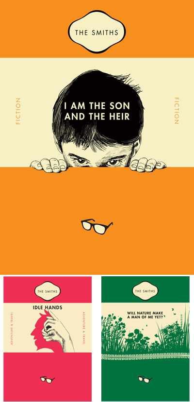
The Smiths book Covers by Chris Thornley aka Raid71
http://www.sourcecreative.co.uk/chris/raid71/
Lots more film posters on his Flickr site. Must be the season for orange and black, Saul Bass influenced posters. Not seen a great Gran Torino yet through, although the real one is decent enough.
http://www.flickr.com/photos/raid71/sets/72157622769280239/.

Black Magic comic book cover by Jack Kirby
This fella is a bit of a legend in the world of comic book illustrators. He helped create Captain America in the 1940s, but his main creations were the characters he created with Stan Lee for Marvel comics in the early 1960s: the Hulk, Thor, the Fantastic 4, the Silver Surfer, the X-Men, the Avengers and many more.
http://kirbymuseum.org/blogs/simonandkirby/archives/1695

Silver Surfer illustration by Jack Kirby
http://marvel.wikia.com/Category:Jack_Kirby/Cover_Artist
. . . . . . . . . . . . . . . . . . . . . . . . . . . . . . . . . . . . . . . . . . . . . . . . . . . . . . . . . . . . . . . . . . .

William S.Burroughs book cover illustration by Charles Burns
Charles Burns is an American illustrator who creates graphic novels, book covers and animations.
Burns started his career in comics working mostly for Raw magazine with Art Spiegelman.
He usually works in black and white but this cover of the Godfather of Punk's book of dreams is a winner.
His best work is his collected series 'Black Hole' which has been resleased as a graphic novel.
Like Raymond Pettibon, he is widely acclaimed as one of the best American counter culture artists working today. He creates album artwork for many alternative music artists.
He recently made an interesting music video for Fever Ray.
He recently made an interesting music video for Fever Ray.
. . . . . . . . . . . . . . . . . . . . . . . . . . . . . . . . . . . . . . . . . . . . . . . . . . . . . . . . . . . . . . . . . . .


by Dave Shrigley
Sometimes when something becomes really bad looking, it gets good again.
Mostly weird, usually funny. Dave Shrigley is an artist, illustrator, humorist, philosopher, chancer.
Have a look around at his work and decide for yourself.
. . . . . . . . . . . . . . . . . . . . . . . . . . . . . . . . . . . . . . . . . . . . . . . . . . . . . . . . . . . . . . . . . . .
The Smiths book Covers by Chris Thornley aka Raid71
This link was sent in by one of our ex students so thanks Shula . Some good - made up - book covers.
http://www.sourcecreative.co.uk/chris/raid71/
Lots more film posters on his Flickr site. Must be the season for orange and black, Saul Bass influenced posters. Not seen a great Gran Torino yet through, although the real one is decent enough.
http://www.flickr.com/photos/raid71/sets/72157622769280239/.
. . . . . . . . . . . . . . . . . . . . . . . . . . . . . . . . . . . . . . . . . . . . . . . . . . . . . . . . . . . . . . . . . . .

Black Magic comic book cover by Jack Kirby
This fella is a bit of a legend in the world of comic book illustrators. He helped create Captain America in the 1940s, but his main creations were the characters he created with Stan Lee for Marvel comics in the early 1960s: the Hulk, Thor, the Fantastic 4, the Silver Surfer, the X-Men, the Avengers and many more.
If you don't like superheroes you could blame it on the doll or have a look at his DC horror comic books.

Silver Surfer illustration by Jack Kirby
But if you do like the superhero stuff then he's the Don.
. . . . . . . . . . . . . . . . . . . . . . . . . . . . . . . . . . . . . . . . . . . . . . . . . . . . . . . . . . . . . . . . . . .

Album cover for The Beatles' Revolver designed by Klaus Voorman
I know this is a bit of an old one and you may have seen it before but it's worth another look.

T-shirt designed by Olly Moss
In homage to the Beatles cover above. I promise I'm not being paid to promote him, his work just seems to keep copping up in relation to what we're doing.
This week I will be mostly looking at Black & White square things.
. . . . . . . . . . . . . . . . . . . . . . . . . . . . . . . . . . . . . . . . . . . . . . . . . . . . . . . . . . . . . . . . . . .

Album cover for Sonic Youth's 'Goo' illustrated by Raymond Pettibon
A brilliant and influential illustrator who has designed for many American punk and hardcore bands.
Have a look at the hundreds of pics on his minimal website.
(while you're at it, have a listen to some Sonic Youth or Black Flag).
Raymond Pettibon x Sonic Youth x Kid Acne = Very good.

The Sheffield version of cool, illustrated by Kid Acne
(And while your at it, have a listen to some Sonic Youth or Black Flag).
. . . . . . . . . . . . . . . . . . . . . . . . . . . . . . . . . . . . . . . . . . . . . . . . . . . . . . . . . . . . . . . . . . .

Diamonds are Forever film poster artwork by Robert E. McGinnis

The original had to be re-done due to the accidental placement of certain items.
This and more classic movie posters on the website below:
. . . . . . . . . . . . . . . . . . . . . . . . . . . . . . . . . . . . . . . . . . . . . . . . . . . . . . . . . . . . . . . . . . .

Taxi driver film poster designed by Steve Dressler on Reelizer
Phil Emberton found us this website of posters by reading a weekend Newspaper's magazine supplement.
They're cheap and safe and when you've read it you can cut it up for your sketchbook research or you can add it to your contextual folder or as most printed articles will have an online version, you could add a link to your blog.
They're cheap and safe and when you've read it you can cut it up for your sketchbook research or you can add it to your contextual folder or as most printed articles will have an online version, you could add a link to your blog.
If you go on the artist page there are loads of people for you to look up including:

The Birds poster designed by Marian Bantjes and Corey Holms
http://www.coreyholms.com/
. . . . . . . . . . . . . . . . . . . . . . . . . . . . . . . . . . . . . . . . . . . . . . . . . . . . . . . . . . . . . . . . . . .

Brilliant hand made revolutionary protest posters from the 1960s and 1970s.
These could help to influence your current designs for book covers, t-shirts or film title sequences.
These could help to influence your current designs for book covers, t-shirts or film title sequences.
This is Guardian article which first got me into them.
This is the Poster Workshop's website.
. . . . . . . . . . . . . . . . . . . . . . . . . . . . . . . . . . . . . . . . . . . . . . . . . . . . . . . . . . . . . . . . . . .

Dirty Harry poster designed by Olly Moss
At first glance I thought that this was an original poster from the 1970's, but after researching Olly Moss more it seems it is part of a range of modern posters all made using the same colours and techniques.
Great use of a limited colour palette and some of the designs use clever graphic elements (Clint Eastwood’s face is made from the negative space of his Magnum) and some shadows form multiple images (Rocky’s arms being help high in silhouette as part of the steps he runs up in the famous montage, training scene.
Have a look at the rest of these posters via the link. My favourites are the Dirty Harry and the Robocop ones, although the Saul Bass Influenced Rocky poster is great as well.
or for even more of his stuff (too talented this one, makes you more than a bit jealous)
http://www.ollymoss.com/
found this one as well, thought they were good... looked closer and realised they're even better
(very clever, look at what the eyes on C3po and Bobba Fett are).
http://www.ollymoss.com/
found this one as well, thought they were good... looked closer and realised they're even better
(very clever, look at what the eyes on C3po and Bobba Fett are).
. . . . . . . . . . . . . . . . . . . . . . . . . . . . . . . . . . . . . . . . . . . . . . . . . . . . . . . . . . . . . . . . . . .

Star Wars poster designed by Tyler Stout
Possible Drew Struzan influence (as you might expect with these being Star Wars posters).
Again the designer has used a limited amount of colours and this helps you to view the intricate - almost etched – detail.
The Star Wars geek in me loves the fact that he has used the original working title ‘Revenge of the Jedi’ (rather than Return of the Jedi), and this links it in to the last film of the series to be released.
. . . . . . . . . . . . . . . . . . . . . . . . . . . . . . . . . . . . . . . . . . . . . . . . . . . . . . . . . . . . . . . . . . .

Vertigo film poster designed by Saul Bass
The type looks lino cut and the image reminds me of Spirographs when I was a kid.
Similar to the Olly Moss posters, although I think the influence works the other way.
Had this on my wall at home for several years and I'm still not bored of it.
and this one
the guy pretty much invented Film Title sesquence design with the title for the Frank Sinatra film "The man with the Golden Arm'. The arm motif linking us to the fact that the main character was a drummer, a junkie and a card dealer.
http://saulbass.tv/
http://saulbass.tv/
. . . . . . . . . . . . . . . . . . . . . . . . . . . . . . . . . . . . . . . . . . . . . . . . . . . . . . . . . . . . . . . . . . .

Obama poster and Andre the Giant stickers designed by Shepard Fairey

Andre the Giant has a posse. No one knew what the stickers meant when they first popped up in L.A and then all over America.I even found one at College once. Brilliant.
He now does everything from great book covers (in both senses) for Penguin to political posters for major parties.
Obey Shepard.
. . . . . . . . . . . . . . . . . . . . . . . . . . . . . . . . . . . . . . . . . . . . . . . . . . . . . . . . . . . . . . . . . . .

Graphic Novel cover artwork by Bill Sienkiewicz
No excuse really. Just like his Illustrations and he has a very poster like style of layout.
He has worked as a concept artwork for many Hollywood movies and has translated some classic stories into sequential artwork. Not to everyones taste but he has experimented with mixed media very effectively in the past.
. . . . . . . . . . . . . . . . . . . . . . . . . . . . . . . . . . . . . . . . . . . . . . . . . . . . . . . . . . . . . . . . . . .
2015: this year I have been mostly
watching Daredevil (series 1)watching House of Cards (series 1 - 3)
reading DMZ (volumes 1 - 10) by Brain Wood
reading Scalped (volumes 1 - 11) Jason Aaron
reading Scalped (volumes 1 - 11) Jason Aaron
listening to P.E, Killing Joke, P.I.L. & the Duritti Column
reading 'Clockwork Orange' by Anthony Burgess
reading 'Clockwork Orange' by Anthony Burgess
. . . . . . . . . . . . . . . . . . . . . . . . . . . . . . . . . . . . . . . . . . . . . . . . . . . . . . . . . . . . . . . . . . .
2014: this year I have been mostly
watching Breaking Bad (series 1 - 3)
reading Lucifer (volumes 1 - 11)
listening to Can, Neu, Pink Floyd, David Bowie & Iggy Pop
reading Chuck Palahniuk's 'Damned'
reading Chuck Palahniuk's 'Damned'
. . . . . . . . . . . . . . . . . . . . . . . . . . . . . . . . . . . . . . . . . . . . . . . . . . . . . . . . . . . . . . . . . . .
2013: this year I have been mostly
watching The Walking Dead (series 1 & 2)reading The Walking Dead volumes 10 - 18 (thanks Matt)
watching The Trailer Park Boys (series 4 - 6)reading The Sandman (volumes 1 - 11)
listening to Radiohead and Morrissey (still)
reading John Constantine: Hellblazer (volumes 1-14 ish)
sleeping a bit more
. . . . . . . . . . . . . . . . . . . . . . . . . . . . . . . . . . . . . . . . . . . . . . . . . . . . . . . . . . . . . . . . . . .
2012: this year I have been mostly
watching Mad Men (series 1) & Avengers filmswatching The Trailer Park Boys (series 1 - 3)
reading The Walking Dead volumes 1 - 10 (thanks Matt)
mourning the Red Shark (the car of the future has retired)listening to random mix CDs in the Silver Surfer (same model, different colour)
reading The Sisters Brothers by Patrick DeWitt
not sleeping (welcome to the world Clarice x)
. . . . . . . . . . . . . . . . . . . . . . . . . . . . . . . . . . . . . . . . . . . . . . . . . . . . . . . . . . . . . . . . . . .
2011: this year I have been mostly
watching the Sopranos (series 4, 5 & 6) and Gran Torinoreading Chuck Palahniuk's 'Haunted' (it's taken me 3 years)
listening to The Rolling Stones & David Bowie
reading The Manga Jesus
looking at Dave Shrigley books
driving the Red Shark

http://www.myfonts.com/person/Herb_Lubalin/
https://www.youtube.com/watch?v=wOgIkxAfJsk
https://www.thebookdesigner.com/2010/03/carol-twombly-an-extraordinary-type-designer/
http://www.designishistory.com/1940/joseph-mueller-brockmann/
https://www.fontshop.com/content/adrian-frutiger-1928-2015
http://www.designishistory.com/1920/jan-tschichold/


No comments:
Post a Comment
Note: Only a member of this blog may post a comment.