Tuesday, May 14, 2019
Monday, May 13, 2019


Friday, May 10, 2019


Saturday, May 4, 2019
Friday, April 12, 2019
Using a dream portfolio to develop as an artist
https://create.adobe.com/2019/2/27/using_a_dream_portfo.html
During my year as an Adobe Creative Resident, I’ve gone through an extremely intensive learning process that has shaped me into a completely different artist than I was when I began as a Resident, in May 2018. It would have otherwise taken years for me to get to this point in my artistic development, but a few key factors fast-tracked my progression—one of them being a dream portfolio!
During my year as an Adobe Creative Resident, I’ve gone through an extremely intensive learning process that has shaped me into a completely different artist than I was when I began as a Resident, in May 2018. It would have otherwise taken years for me to get to this point in my artistic development, but a few key factors fast-tracked my progression—one of them being a dream portfolio!
I was taught this lesson by Lee White—you can find more fantastic information and demos about how to become a better artist from him, Will Terry, Jake Parker, and other amazing artists at the Society of Visual Storytelling. Lee was a teacher of mine in college, and the amount of artistic and business knowledge that he shared with me and other students made all that college debt worth it.

The image on the left is an older illustration that Daviscourt created; the image on the right reflects how her illustration style has progressed, as she moves toward her goal of becoming an illustrator of children’s books.
Daviscourt says, “I recently revisited an old piece to really hammer home the new style that I had developed with my latest dream portfolio. I love seeing the clear progression and knowing that each new piece is better than the last!”
I made my first dream portfolio in art school, and again about seven years later when I got kicked into gear. I realized that mindlessly making pretty stuff would never get me the fulfilling career that I dreamed of—I had to be present in my progression as an artist.
So what is a dream portfolio? It’s a selection of your all-time favorite pieces of art, which you study in order to develop your skills in a specific direction.
STEP 1: FIND WHAT YOU LOVE
If you aren’t gathering reference on the regular yet, start now! My favorite sites for this are Behanceand Pinterest. Social media can be a great source as well—just make sure to save images that catch your attention along with the artists’ names. Creating this treasure trove of imagery will give you a quality pile to comb through when you’re looking for your favorite art.

Daviscourt finds reference and inspiration on Behance, as well as on Pinterest and other social media platforms.
This year, I switched from doing concept art to the world of children’s publishing, so it was essential that I find children’s book art to pull from. It wasn’t that I was creating bad artwork; it’s just that the work I was creating wasn’t serving my career growth.
Looking at my older work now, I feel that it lacked purpose and wasn’t very consistent. But above all, it didn’t fit into the world of children’s publishing like my newer work does. I bet in another five years I’ll have a totally different style, but I know it’ll be what I love!

Daviscourt says that her newer work—such as this illustration—is more in line with what she wants to be creating. See more of what she is working on, on her Behance page.
Once you’ve picked out around 10 to 15 images that you can deem your favorites, you’re ready to move to the next step:
STEP 2: FIGURE OUT WHY YOU LOVE IT
Now it’s time to dissect your favorite work. I would recommend stepping back to take in all of the pieces at once. What do the images in your collection have in common? Are the colors, mark making, shape design, and/or storytelling techniques similar? Is there something that catches your eye first in each piece? Write everything down.

These illustrations by Taylor Price, Dung Ho, and Disha Orsha are among the favorites in Daviscourt’s dream portfolio.

Next, go one by one through the images and write down your favorite aspects of each one. Make sure to take breaks and come back to see your collection with fresh eyes. Write everything down, and hopefully you’ll notice some patterns and make new discoveries about what you love most.

Daviscourt added this image, by Jacob Grant, to her dream portfolio because she admires its shape design, color palette, texture, lighting, and magical tone.
STEP 3: STUDY THE SKILLS
Once you’ve identified your favorite aspects of the artwork, it’s time to do some studies of the pieces. This can greatly widen your understanding of what you’re capable of while also guiding you closer to the style that you want in your work.
There are two ways of going about studying your dream portfolio:
The first is a master study. This is a replication of the original artwork, starting from scratch and using nothing but your eyes. No color picking, no overlaying—challenge yourself to get it exact!
The second is a technique study. Take an element of how the artist creates their work and replicate it. If the element is design based, sketch it out. If it’s technique based, paint a swatch. Just figure out how the artist might go about making that art, and then do that.
If you’re ever stuck because you don’t know the medium/technique they use, look at more pieces in their portfolio or just ask them!

Daviscourt does style studies of artists she admires, such as illustrator Emily Hughes.
STEP 4: LEVEL UP
Now it’s time to put this knowledge to use! Design a new piece while keeping your dream portfolio handy. I guarantee that if you follow this method without skipping the tough bits, you will begin to see a change in your work. You might even want to choose an older piece and re-create it.
STEP 5: KEEP IT UP
You should refresh your dream portfolio regularly, just like your personal portfolio. Make sure to reassess what you truly love about what you do and where you want to fit within the design world. It may sound really simple, but stepping back and reframing what you’re spending your life doing is extremely beneficial.
There are infinite ways to customize this process, so trust your instincts and keep moving forward!
Create a Shimmering Cityscape in Perspective

The Perspective tools in Illustrator CS5 make it a lot easier to draw in perfect one, two or three-point perspective. Using symbols in conjunction with the Perspective tools will make quick work of this stylized cityscape.
Republished Tutorial
Every few weeks, we revisit some of our reader's favorite posts from throughout the history of the site. This tutorial was first published in April of 2011.
Step 1
Click the Perspective Grid Tool. Two things appear on your artboard: The Perspective Grid and the Active Plane Widget. You can change the placement of the Widget by double-clicking on the Perspective Grid Tool to bring up its options. The Widget can only be placed in one of the four corners — you can't move it freely.
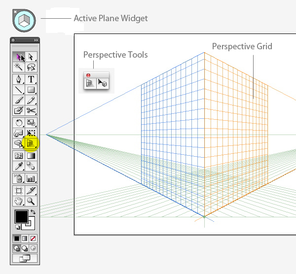
A basic 2-point grid is the default setting. If you don't see something like the grid above, go to View > Perspective Grid > Two Point Perspective and choose the Normal preset.
Using the Perspective Grid tool, move the Horizon line down, close to the ground level. This will give a dramatic perspective with exaggerated vanishing points.

If you want, you can save this grid as a preset to use for future illustrations. Go to View> Perspective Grid > Save Grid as Preset to do so.
Step 2
If you're new to the Perspective tools, get a feel for how they work by drawing a few shapes in perspective. First, make sure the grid is visible and click the left plane (dark blue) on the Widget. Now take the Rectangle Tool (M) and draw on the left plane. Your rectangle will be drawn in perspective, fixed to the grid. Notice that the cursor crosshairs now have a left-facing arrow next to it.
This is a visual cue that lets you know which plane is active as you draw. Now Switch to the Perspective Selection Tool (Shift + M) and move the rectangle. You'll see that the rectangle's corner points are solid, rather than hollow, and look heavier than normal ones, indicating that the shape is in perspective. As you move it, the object will stay in perspective, even if you move it off the visible grid.

Step 3
Select the right plane (Orange) and draw another rectangle. Line it up with the first one, and you have the basic structure of a building in perspective.

You can now add elements, such as windows, by drawing a smaller rectangle and drag-copying it — with the Perspective Selection tool — several times to make a row (or drag out one copy, then press Command + D to make a few more). All subsequent copies will remain in perspective.

Step 4
You could continue drawing more rectangles and lining them up on either plane, but that can get tedious. A faster method is to construct the buildings flat (i.e., not in perspective), then make them into symbols, then place them on the grid.
Choose a lighter and darker variation of one color (I'm partial to orange), and make some simple building shapes. You'll enhance these later with gradients, but for now, keep it basic. Make one set that's lighter, and another version with the darker color. These will be used for the light side of the illustration, and the building facades that are in shadow, respectively.

Step 5
Drag each building into the Symbols panel. You can give each one a name if that helps you keep track of them— it can be hard to tell when you're looking at them in thumbnail view.

Step 6
Drag out a "lighter" symbol to the art board. Make sure the Left Plane is active, and using the Perspective Selection tool (Shift + V), drag the symbol into place. You'll see that it snaps to perspective. Do this a few more times, keeping the lighter buildings on the left plane.
Do the same with the darker building symbols, placing them on the right plane. Choose the plane on the widget, or press "3" to activate it.

Step 7
If you have a light and dark building shape placed where the two planes intersect, you'll notice that each side matches up. But if you try to add a dark side to a light shape that's further to the left of the intersection point, the new shape won't line up. The is because if you drag an object that's in perspective on the right plane, and try to match it up to one the right, the left shape will grow in size as you drag, because it continues to adhere to the perspective grid.
So what you need to do is drag that shape perpendicularly, in perspective.
Select the shape with the Perspective Selection tool, hold down the '5' key and drag it to the left. A line indicates that you are dragging perpendicularly.

Step 8
Continue constructing buildings this way, until each facade has a matching side. You'll probably have to send some shapes behind others, which you can do without affecting the perspective.

Step 9
Once all the buildings are arranged to your liking, zoom in and make sure each side of each building is lined up neatly. They do not have to align to a grid line, but if you nudge an object with the arrow keys, it will snap to the nearest one.

Step 10
To give the illustration some polish, add gradients to each building shape. To do this, you must first release the shapes from the Perspective Grid. Select a shape and go to Object > Perspective > Release with Perspective. This will break the link to the Symbol, so you can now change the appearance of each object.

Step 11
Create a set of gradients that are made up of your two original colors, with a darker and lighter color in each. As you color the shapes, use the gradients to enhance the sense of depth in the cityscape. Visualize the light source and color the buildings accordingly, while maintaining a cohesive look.
Applied carefully, gradients can also add depth and interest to the windows and details of the buildings.

Step 12
Now we'll make the reflection. Create a new layer below the first layer. Select the entire cityscape, and click the little colored square in the Layers panel. Hold down the Alt key, then drag the square down to the new layer. This will create a copy of the objects on the bottom layer. Lock or hide the top layer.

Step 13
With the copy still selected, double-click the Reflect Tool and reflect the objects horizontally. Drag the reflected copy down, so that it's just below the original. This will be the reflection.

Step 14
To simplify the reflection and make it less distracting, delete all the details on each building. This is kind of a chore, but you can make it easier by viewing the reflection in Outline mode and selecting multiple windows and other details with the Direct Selection Tool (A), and/or the Lasso Tool (Q).

Step 15
Since the cityscape is a perspective drawing, making the reflection isn't as easy as simply flipping the shapes and placing them below the original. Select just one half of the reflection. Choose the Free Transform Tool (E), then grab the outer side of the selected objects, and drag it up, while holding down the Command key. Add the Shift key to keep the transformation aligned vertically. It can be a bit tricky to master this finger dance, but after a few tries, you'll get the hang of it. Skew the refection until it meets the main cityscape shape. Do the same with the other half.

Step 16
When you are satisfied with the skewed halves, draw a rectangle that covers the entire reflection. Fill this rectangle with a black to white linear gradient, as in the image below.

Step 17
Select the rectangle and the reflection objects. In the Transparency panel, click the flyout menu and choose Make Opacity Mask. The reflection should now appear to fade out. If not, try clicking Invert Mask in the panel.

Step 18
If necessary, adjust the fade-out by editing the gradient. Click on its thumbnail in the Transparency panel and adjust it with the Gradient tool.


Step 19
Nudge the reflection up or down if necessary. Then sit back and admire your shining city!
Conclusion
Before the Perspective tools were introduced in CS5, it was entirely possible to make an illustration such as this one, but you had to carefully measure and plot your own grid. Creating such a grid could take as long as it did to make the rest of the illustration. The Perspective toolset eliminates the need for all that time-intensive preparation, and allows you to concentrate on the creative part of illustrating.
Subscribe to:
Posts (Atom)
Featured Post
Computers in Art Practice:Manfred Mohr
Artist Manfred Mohr Since 1969, Manfred Mohr has used computers and plotters as electronic and digital drawing aids, thus making inevita...
-
 Able to understand why a design brief is critical to the design process Explain the purpose of a design brief The design ...
 -
 Principles of marketing and evaluation 1 .1 explain the importance of defining market segments to the developm...
 -
 What is a sales funnel? A sales funnel is a visual representation of the steps required to sell your products or services. A sales funnel s...
 -
 How to Create Effective Marketing Campaigns by Sam Ashe-Edmunds Related Articles 1 Top Ten Promotional Strategies 2 How to I...
 -
 Develop Design Principles and Techniques and Processes for Designing Products Give examples of how formal elements and principles of...
 -
Adobe Illustrator is the perfect tool for creating abstract art with basic shapes and lines. In today’s tutorial I’ll show you how to creat...
-
 Understand the formal elements and principles of design Give examples of how formal elements and principle...
 -
This is the ability to use IT tools and devices for collaborative working and communications, such as web or video conferencing, instant me...
-
 Understand how to organise and evaluate data that has been researched. 1.1 describe purpose and benefits of organising data so that it c...
 -
 Personal and professional development Einstein stressed that lifelong learning should be a focus because personal growth stops whe...
