Pepsi
One of the most reviled ads in recent memory, Pepsi’s two-and-a-half minute spot “Live for Now,” featured Kendall Jenner leaving her modeling job to join a nondescript protest. In the ad, tensions are mounting between protesters and police—that is, until Jenner magically solves everything by opening a Pepsi for a cop. The brand quickly pulled the spot, which was released in early April, and apologized.

There’s so much in the ad that doesn’t make sense. Why would protest signs read “Join the Conversation”? How are we supposed to feel something for Jenner right after she rips off her wig and carelessly tosses it at a black woman standing next to her?
Lesson learned: Arguably, the biggest brand gaff Pepsi committed with this spot was putting its product in the center of social issues while simultaneously trivializing said issues. As writer, social worker and activist Feminista Jones eloquently put it earlier this year when asked about the ad, “brands should never make light of social issues related to people’s suffering; they should, instead, focus on selling their products in ways that don’t exploit the pain and suffering of marginalized people.”
Dove
In October, Dove posted a social ad on its Facebook page that featured a black woman taking off a shirt similar to her skin tone to reveal that she had turned into a white woman wearing a shirt similar to her skin tone. Suffice to say, people immediately and rightfully criticized the ad, calling it racist and pointing out how it was similar to racist Victorian-era soap ads. After receiving the much-deserved criticism, Dove pulled the ad and apologized: “In an image we posted this week, we missed the mark in thoughtfully representing women of color and we deeply regret the offense that it has caused. The feedback that has been shared is important to us, and we’ll use it to guide us in the future.”
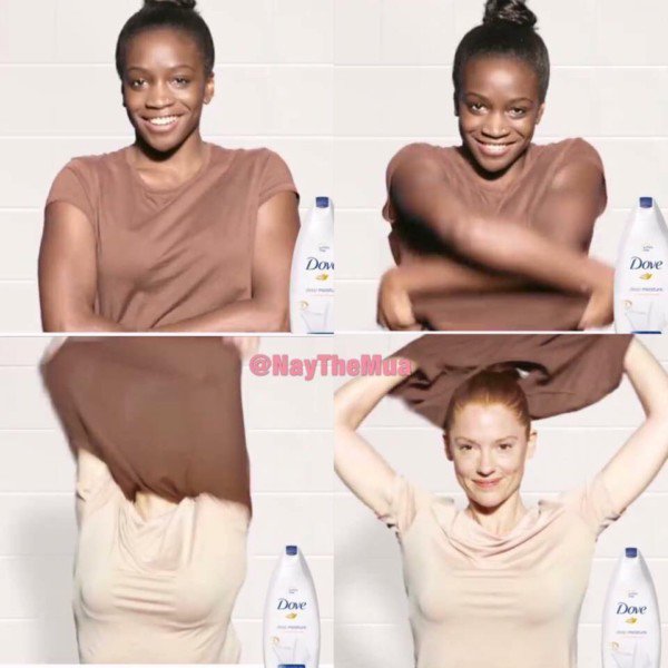
Shortly after the ad was pulled, Lola Ogunyemi, the black model featured in it, penned an op-ed for the Guardian where she gave readers context and noted that the “full TV edit does a much better job of making the campaign’s message loud and clear.”
Lesson learned: While context certainly helps, Dove—or any brand, for that matter—should never create an ad that could so easily be taken out of context, especially one that could read as having a racist message.
It’s not an ad per se, but Facebook CEO Mark Zuckerberg was probably hoping that using the company’s Facebook Spaces VR app to tour the damage in Puerto Rico after the hurricanes in October would result in people wanting to use the app. Instead, Facebook’s decision to conduct a “magical tour” (as Zuckerberg dubbed it) of the damage was seen as exploitative. While it certainly wasn’t Facebook’s only fail of the year—Russian ads, anyone?—it was still a huge public-facing flop.
View image on Twitter

Lesson learned: Think about your ad from multiple perspectives. An internal team should have the wherewithal to warn someone about the potential pitfalls of covering sensitive subjects like natural disasters.
Uber
Again, not an ad, but a series of brand flops: During the first half of the year,
Uber was repeatedly in the news, and none of it was good. Uber was a brand in crisis.
First, in January, Uber made headlines for its approach to Trump’s Muslim ban.
The following month, ex-Uber SRE (site reliability engineer)
Susan Fowler detailed the workplace harassment she faced at the company; Uber subsequently
launched an investigation into sexual harassment.
But that same month, a video emerged of then-CEO Travis Kalanick berating an Uber driver.
That news was followed by the announcement in March that the ride-sharing app’s president,
Jeff Jones (previously Target’s CMO), would step down because Uber’s “beliefs and approach to
leadership” were not in line with his own. Shortly after that,
new reports emerged, detailing an instance in 2014 when Kalanick
went to an escort/karaoke bar in Seoul with other Uber execs.
In June, Kalanick finally stepped down from his role as CEO. That same month,
Bozoma Saint John was hired as Uber’s first chief brand officer; since then, much
of the news has been about various things Uber is testing instead of its damaged brand.
Lesson learned: Today’s public wants to support companies whose beliefs align
with their own—and skeletons won’t stay in the closet for long.
McDonald’s
In May, McDonald’s released a 90-second spot in the U.K., “Dad,” which struck
many viewers as odd and exploitative. The spot followed a young boy asking his
mother to tell him what his father was like before he passed away. Throughout the
ad, the boy is clearly hoping one of the descriptions will line
up with something that would describe him. None of them do—until he’s with his
mom at McDonald’s, where she lovingly explains that his order (a Filet-O-Fish) was his
dad’s favorite too.
After swift criticism of the ad online, McDonald’s pulled the spot, apologized, and
noted that it would review its creative process to prevent an error like this from
occurring again. Still, why McDonald’s would want to tell a story about grief
while also trying to sell a fish sandwich…well, we may never have an answer to that question.
Lesson learned: This one covers all of these brand flops: Don’t exploit people’s
pain for an ad. Just don’t.

5 Epic Branding Fails from Mega Corporations (And What You Can Learn from Them)
Here they are with billions of dollars, hundreds or thousands of people to work on a single
campaign, and supposedly some of the brightest minds in the business community giving
them advice, and yet when we as consumers finally get to see what they roll out…
sometimes it’s just stupid. You look at it and think, "How on earth did they ever
believe this would work?"
We all know about classic blunders like New Coke and the Arch Deluxe, but really,
those are just the tip of the iceberg. Look around, and the marketing world is full of epic branding fails.
I’ve been studying them for years, and while I can’t tell you why they continue to happen,
I can say there’s a lot to learn from watching their products flop. Let’s go through a few
examples, and I’ll show you what I mean:
Fail #1: Not Having Answers to “What Exactly Is It?" and "Why Should I Want It?”
Back in the early 80s shampoo megabrand Clairol introduced two shampoos named,
“Look of Buttermilk” and “Touch of Yogurt.” And the products flopped.
For one, you have to wonder… are you washing your hair in actual yogurt? And if
you are, why would you want to do that? Wouldn’t it be kind of… sticky?
For two, if you’re naming a product the "Look of Buttermilk," what exactly does
buttermilk look like? Not everyone knows, and prospective customers were confused.
Why would you want your hair to look like milk?
In both cases, the products were inexcusably vague. Not only did they fail to
communicate the benefit, but they failed to communicate with the product actually was.
It’s no wonder they flopped.
Fail #2: Lending Your Brand to Products in an Unrelated Market
Some brands have a name that makes anything popular “by association.”
Sony can release almost any type of electronics product, and people will buy
it just because it’s Sony. Stouffer can release almost any type of prepackaged
meal, and people will buy it because they know it’ll taste homemade (or close to it).
Both companies regularly test new products, putting their name on them and seeing
how they sell, and they often do well, solely on the strength of the brand.
The important point though is that they release products within their niche. Sony isn’t
trying to make prepackaged food, and Stouffer isn’t trying to sell electronics.
It makes sense, but big brands forget all the time.
Harley Davidson fans will buy just about anything emblazoned with the famous
logo: t-shirts, lighters, jackets – everything a biker needs. But when they tried to
introduce Harley Davidson perfume and aftershave, fans revolted. If you drive a
Harley, you don’t want to smell nice. You want to smell though, like leather and
motor oil, and you don’t need perfume or aftershave to help you do that.
Fail #3: Failing to Evolve with the Market
Ask your grandparents about Ovaltine, the malted milk drink, and chances are they
can hum or whistle the radio jingle that used to accompany it. These days,
Ovaltine is promoted as more of a health drink or a breakfast shake, but it still fails to
gain much brand recognition among anyone younger than 60.
Why?
Because it held too tightly and too long to its previous purpose: a sleep
aid before bed. They thought they’d carved out a market niche, but as
the market evolved, more and more customers moved to drinks like
Ensure who marketed their ability to serve as a meal replacement.
Ovaltine should’ve evolved with the market, but they didn’t, and
now they are suffering for it.
The lesson: nostalgia does not always equal better sales.
Fail #4: Launching When the Market Isn’t Ready
No one but the most mobile of urban professionals carried a
smartphone in the early 90s, but that’s precisely when Apple
leapt onto the scene with its Newton PDA.
Unlike more modern Apple innovations, such as the iPhone and
iPad, the Newton didn’t beget long lines of early adopters.
Instead, it got blasted by everything from talk shows to comic strips for its
poor handwriting recognition and massive price tag (~$700).
Since no trendsetter wants to align themselves with something unpopular,
Newton faded into tech-antiquity while cheaper, smarter devices like the
Palm Pilot and Blackberry began to stake their claim in the digital market,
which was ready for innovation.
Fail #5: Promising One Thing and Delivering Another
If you say you stand for one thing, and deliver something completely different,
you can bet customers won’t fall for it twice.
Case in point: Domino’s Pizza. The longtime king of fast delivery, good and
cheap pizza was quickly unseated by complaints of cardboard-like crust and
sauce that tasted like ketchup. Yes, it was fast, and yes, it was cheap, but it
wasn’t good, and by promising customers good pizza, they raised expectations
too high, setting themselves up to fail.
These days, Domino’s has finally stepped up to the plate and admitted their faults,
promoting an entirely new type of dedication to the art of pizza-making. But is it too little, too late?
A brand identity, name, and logo is a company's public face. So you'd think
companies would be really careful in figuring out how to revamp that image.
Sadly, a good number of recent rebranding attempts seemed to just crash and burn.
The lesson? A successful rebranding involves overhauling a company's
goals, message, and culture -- not just changing a name or a logo.
Also, messing with a classic is, more often than not, a bad idea.
Unfortunately, despite their massive marketing budgets, it seems like many
major corporations (and one major international city) haven't gotten the memo.
The SciFi Channel's "text-friendly" new name is a slang word for syphilis

Maybe the SciFi Channel should have checked out urbandictionary.com before it rolled
out its new name. They would have discovered that, in most parts of the world, "syfy" is a
slang term for syphilis.
The company's main justification for the change was that, while they couldn't trademark the
The company's main justification for the change was that, while they couldn't trademark the
term "sci fi," they could own the alternate spelling.
In an interview for TVWeek , president David Howe explains another reason: "[T]he thing
In an interview for TVWeek , president David Howe explains another reason: "[T]he thing
that we got back from our 18-to-34 techno-savvy crowd, which is quite a lot of our audience,
is actually this is how you'd text it ... It made us feel much cooler, much more cutting-edge,
much more hip."
Not surprisingly, "the response was completely negative," Frankel tells us. "[The change] alienated many longtime fans, and it was completely ridiculed."
And being associated with an STD is never a good marketing tactic.
Tropicana underestimates their customers' attachment to a classic

Silly PepsiCo! All it was trying to do was bring its classic Tropicana OJ into the 21st century.
Unfortunately, the company underestimated how attached their customers had become to
the old design. When it rolled out its new cartons in January 2009, the consumer backlash
was immediate and powerful.
The New York Times reports that "[ s]ome of those commenting described the new packaging as
"ugly" or "stupid," and resembling "a generic bargain brand" or a "store brand. ""
After a month of being bombarded by e-mails, phone calls, and social media commentary,
PepsiCo announced that it would promptly return to the old carton.
London may have won the bid, but its weird Olympic logo has everyone up in arms

Not surprisingly, "the response was completely negative," Frankel tells us. "[The change] alienated many longtime fans, and it was completely ridiculed."
And being associated with an STD is never a good marketing tactic.
Tropicana underestimates their customers' attachment to a classic
Silly PepsiCo! All it was trying to do was bring its classic Tropicana OJ into the 21st century.
Unfortunately, the company underestimated how attached their customers had become to
the old design. When it rolled out its new cartons in January 2009, the consumer backlash
was immediate and powerful.
The New York Times reports that "[ s]ome of those commenting described the new packaging as
"ugly" or "stupid," and resembling "a generic bargain brand" or a "store brand. ""
After a month of being bombarded by e-mails, phone calls, and social media commentary,
PepsiCo announced that it would promptly return to the old carton.
London may have won the bid, but its weird Olympic logo has everyone up in arms
The Associated Press
If there's anything we've learned today, it's that you shouldn't mess around too much
with a classic. And there are few things more classic than the Olympics.
But the organizers behind London's 2012 logo wanted to inject a little modernity
into the branding of their Games. As their website puts it , "Our emblem is simple,
distinct, bold and buzzing with energy.... It feels young in spirit... Not afraid to shake
things up, to challenge the accepted. To change things."
Unfortunately, the unveiling was met with resounding disapproval, and even hostility.
ABC News reports that the logo, which cost $800,000 to create, was generally deemed as
childish, ridiculous, ugly, and in no way representative of London or the Games. Visually,
"it's really hard to understand what they're trying to say," Method's Alicia Bergin commented.
In an unofficial public poll by the BBC , 80% of those surveyed gave the logo the lowest
possible ranking.
Radio Shack tries really, really hard to be hip, with "The Shack"

Described as "totally ridiculous" by our branding experts, Radio Shack's decision to call
itself "The Shack" was a sad attempt to be hip.
"Why would anyone throw away decades of brand value (which actually shows
up on the balance sheet as an intangible asset) just to try to be cool for a few minutes?"
Frankel asks.
Engadget's Joshua Topolsky puts it aptly when he supposes that " they wanted us to
immediately picture a remote location where very, very bad things happen."
Capital One revamps with a dated and irrelevant swoosh

This is another failed attempt by a large company to relate to consumers on a hipper level.
Unfortunately, Capital One was about a decade too late with their addition of a "swoosh" in 2008.
Brand design blog Brand New reacted like this: "Nothing, in the year 2008, can justify the
use of a swoosh. "
"It doesn't add any distinction, and it's been done a million times before," Bergin tells us.
"They wanted to have more of a consumer-facing feel, but this is too obvious."
Accenture: The ultimate corporate name that means nothing

When Andersen Consulting cut ties with Arthur Andersen, they
did the worst thing a company could do -- they let a marketing
consultant choose the new brand name.
The result sounds like the quintessential, meaningless, "big corporation" name,
Frankel says. Although it was supposedly inspired by the phrase "accent on the
future," it tells the customer nothing .
As another one of Time' s worst name changes, the article says , " The change cost
Andersen/Accenture an estimated $100 million to execute and was regarded as one of
the worst rebrandings in corporate history ."
Blackwater tries to erase the past with "Xe" (pronounced 'Zee')

After some major human rights violations tainted Blackwater's name in 2007,
the company took Wired's advice and tried to rename itself.
According to an ABC News report , the company explained that it chose 'Xe'
because the word has "no connotations." It's completely meaningless... and confusing.
Unfortunately, a simple name change won't erase the public memory -- the company
is still generally referred to as Blackwater , or some variation of "Blackwater, now renamed
Xe", and it's struggling to get business.
We're not sure why Pepsi's new logo cost them $1
million to develop

Pepsi is no stranger to logo redesigns. But the company reportedly spent $1 million on their latest reincarnation, and it turned out like... this.
Frankel describes the attempt as a " [r]eal waste of time and money, especially if you've seen the
design spec document... An amazing, purposeless document that has no brand value at all," yet cost
Pepsi so much.
The white stripe on the new logo varies across Pepsi products, getting wider or thinner depending
on product. The design team that spearheaded the campaign explains that they're supposed to be
"smiles," but we don't really see it.
As this clever graphic from The Consumerist shows, the Pepsi logo seems to have
been redone nearly once a decade over the last century -- while Coke's iconic logo
has barely been touched . It's not hard to see which is the better strategy here.
Comcast introduces.... "Xfinity"

Named as one of Time magazine's Top 10 Worst Corporate Name Changes ,
Comcast's decision to re-name itself "Xfinity" in 11 of its U.S. markets was just awful.
As we reported , "Xfinity? Seriously? What the heck does that mean? "
"Comcast hopes the new moniker will help customers forget the high prices and
poor customer service for which the company has been criticized in the past," the
Times article says. "Will the name change work? Probably not, but at least it'll sound
a bit edgier when you're put on hold ... with Xfinity. "

And then there's Aol. (yes, with the period) --
and the jury is still out.
According to our sources, the reaction to the new Aol. has been split relatively evenly.
But the key will be whether or not the company can fulfill the new identity they've adopted
through their services and products.
"They've signaled they're re-inventing themselves.... It's ambitious," Bergin says.
"The real challenge is can they make all of their products live up to the promise of this new brand."
The Brand New blog points out , "If AOL is committed to shedding not just its
Time Warner shares but also its public perception as a web dinosaur then this identity
can do it for them."
That is the key to a successful rebranding, after all -- " the real reason to rebrand is to
alter the expectations you're setting for the public ," Frankel explains. "Changing your
brand strategy means becoming different company.... it's not just changing your name or your logo."
Stick a Fork in Them, They’re Done – Biggest Brand Failures of 2017
We’re halfway through 2017 and already we have some serious contenders for the
Brand Fail of the Year award. There’s good marketing, there’s bad marketing,
and then there are just outright WTF marketing moments. The marketing fail gems
that make you realize some marketing creatives are just not spending enough time
outside of the office with the three-dimensional people.
These are the top Big Brand
Marketing Fails of 2017.
Big Brand #FAILS of 2017
Here they are, in no particular order. You will have to decide on a winner (or loser) for yourself.
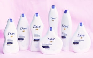
Dove #Fail
Dove took it upon themselves to create a limited (thank goodness)
edition line of “Real Beauty Bottles”. With the help of the mighty
Ogilvy, London, they launched a campaign selling their body wash in
bottles supposedly shaped like “real women”. The idea was to show the
power of diversity of a woman’s body. The reality? They made everyone
feel more self-conscious than ever, only provided 7 different shapes to choose
from, and essentially forced women to choose a bottle the same shape that they are.
Awkward. Maybe the strategist who came up with that one was secretly working for
Johnson & Johnson.
The lesson: Don’t make a separate product package
for each body type, and focus on the important details of why people purchase your products.
Pepsi Cola #Fail
While we understand (but don’t really get) that the Kardashians are a pretty
big deal, and marketing through them is bound to attract attention, we did have
to wonder about Pepsi’s decision to tie Kendall in with their piggy-back
attempt on the #blacklivesmatters movement.
In their infamous video, they featured people of all shapes, colours, and sizes
enjoying a Pepsi with the police. The clip is topped by Kendall Jenner dispelling
racial tension by offering the cops a Pepsi. Needless to say, the Twitter-universe
went wild. People called out the more ridiculous parts of the ad, and Pepsi was forced to
issue an official apology.
The moral here is: Never (ever) make light of a political/human rights issue for the sake
of a quick ad. The issues discussed are far more grave and important than your bottle of soda pop.

Heineken #Fail
(or as we’re calling it, Pepsi fail 2.0)
Just after Pepsi’s epic fail at trying to show how “woke” they are,
Heineken pretty much did the exact same thing, just different.
They made a video with a bunch of people who are from opposing
ideologies, a feminist, a male chauvinist, a transgender woman and
someone who is opposed to that. And so on and so forth. They didn’t
get quite the same Twitter slapping that Pepsi did, and we’re not sure
if this is necessarily a “fail”, but all in all, the ad seemed to lack any
substance other than to show that Heineken is “#wokeAF” as the youths are saying nowadays.
Heineken Worlds Apart AdUber #Fail
Speaking of Political tension…
Uber managed to get their epic fail in early this season. When Donald Trump’s ban
on Muslim countries hit the trade on the 28th of January, the New York Taxi
Workers Alliance asked members to stay away from JFK International airport for
an hour. What did Uber do? They announced a drop in pricing at the airport!
Leaving anti-ban Uber users no choice but to delete the app and take to the
Twitter-verse to let them know just what they thought of them. Not a good
move for Uber- although we are sure that the guys over at Lyft are pretty
happy about all the new custom. Uber tried to save themselves in an epic
back pedal manoeuvre, but the damage was already done, proving not all press is good press.
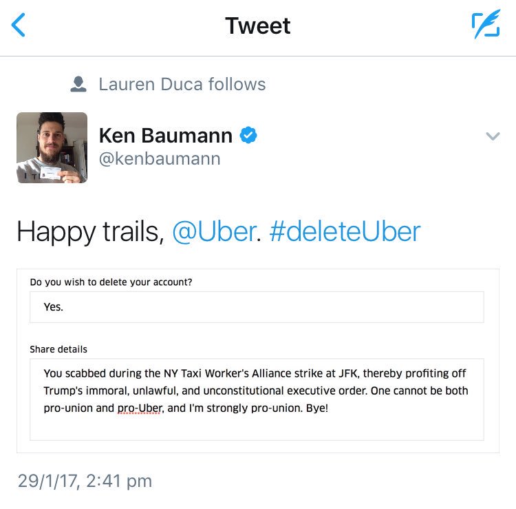
The lesson: It’s up to brands to decide if they will publically side one way
or another in political matters and/or prioritize profit over ethics. Should
your brand choose to take a side, you should discuss all the possibilities
for negativity and how you’ll handle it if it arises.
United Airlines #Fail
United Airlines managed to take themselves down more through their antics this
year than by actual ad spend. What they, unfortunately, failed to think through is
that most people these days have smartphones, and we are all obsessed with
documenting everything. So when they pulled some seriously questionable client
liaison stunts, the world got to know about it, fast. Some of the United Airlines
fails that set Twitter alight this year included:
Body Shaming teen girls for wearing leggings
Dragging an Asian American man from his seat so that a staff member could sit
their sweet petunia down on it, and (our personal twisted favourite)
Killing a bunny rabbit on the damn plane
Twitter has had no shortage of viral material from United Airlines
so far this year, we wait with baited breath to see what they come up with for June through December.
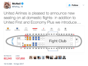
The lesson: treat your paying customers with at least the same basic respects
you’d show any human being?
Wendy’s #Fail
Yet another customer care fail for a big US company in 2017.
Wendy’s got into an ill-advised spat with customers on Twitter
(is it ever a good idea for big brands to quibble with customers – uh, no)
over whether they really use fresh and not frozen beef.
They probably would have gotten away with it if they hadn’t decided to post a
“Pepe the frog” meme on the thread. For those of you who missed it, Pepe was
co-opted by white supremacists at election time in 2016.
Needless to say, screenshots were taken, and although they quickly
realized their mistake and took down the post the damage was already done.
Good luck living that one down, Wendy.
The lesson to be learned: With great pop culture use comes great responsibility.
Also, an encyclopedic knowledge of meme usage is helpful.
Mc Donald’s #Fail
More food politics. Poor old Ronald just didn’t see it coming, maybe it was his hat in the way. In an attempt at a burn against the American President, the McD’s marketing team posted a tweet that read “You are actually a disgusting excuse of a President and we would love to have @BarackObama back,” before dropping the mic with, “also you have tiny hands.” Then they pinned it to the top pf their profile. Um. Needless to say, there were not many Trump supporters at McDonald’s that day. The company later issued an apology and claimed to have been hacked. #Burn.
The lesson: blame technical difficulties
Pizza Hut #Fail
Seriously? When did fast food become so involved in politics? Pizza Hut takes the cake (pun intended) with their crass piggy-backing on Hunger Strike leader and political prisoner Marwan Barghouti. The Hunger strike leader was videoed eating some cookies, and the brand jumped on it as a marketing opportunity. Needless to say, Palestinians launched a boycott against them and things got pretty nasty for Pizza Hut after that.
A word of caution to all marketers out there: Know your audience, and as we mentioned above, don’t make light of a current political situation to make a quick ad.
Adidas #Fail
Apparently piggybacking on all things disastrous, negative and tragic is the name of the game for the “Big Brand Fail” 2017 edition. Addidas has certainly been around long enough to know better, but that didn’t stop them sending a very unfortunate e-mail in the wake of the Boston Marathon bombing in April 2013. The subject line of the e-mail read “Congratulations, you survived the Boston Marathon”. Not cool man, seriously not cool. No matter how long you wait – some things just don’t get funny with time. After some serious roasting for the mail, they were forced to post a hearty apology.

That means we can dig into the following rebranding failures and see exactly went wrong.
For me, the following companies completely messed up their rebranding efforts.
Maybe they should have looked at this post when considering rebranding their company.
Let’s dive in, investigate these rebranding disasters, and see how much the cost:
If there's anything we've learned today, it's that you shouldn't mess around too much
with a classic. And there are few things more classic than the Olympics.
But the organizers behind London's 2012 logo wanted to inject a little modernity
into the branding of their Games. As their website puts it , "Our emblem is simple,
distinct, bold and buzzing with energy.... It feels young in spirit... Not afraid to shake
things up, to challenge the accepted. To change things."
Unfortunately, the unveiling was met with resounding disapproval, and even hostility.
ABC News reports that the logo, which cost $800,000 to create, was generally deemed as
childish, ridiculous, ugly, and in no way representative of London or the Games. Visually,
"it's really hard to understand what they're trying to say," Method's Alicia Bergin commented.
In an unofficial public poll by the BBC , 80% of those surveyed gave the logo the lowest
possible ranking.
Radio Shack tries really, really hard to be hip, with "The Shack"
Described as "totally ridiculous" by our branding experts, Radio Shack's decision to call
itself "The Shack" was a sad attempt to be hip.
"Why would anyone throw away decades of brand value (which actually shows
up on the balance sheet as an intangible asset) just to try to be cool for a few minutes?"
Frankel asks.
Engadget's Joshua Topolsky puts it aptly when he supposes that " they wanted us to
immediately picture a remote location where very, very bad things happen."
Capital One revamps with a dated and irrelevant swoosh
This is another failed attempt by a large company to relate to consumers on a hipper level.
Unfortunately, Capital One was about a decade too late with their addition of a "swoosh" in 2008.
Brand design blog Brand New reacted like this: "Nothing, in the year 2008, can justify the
use of a swoosh. "
"It doesn't add any distinction, and it's been done a million times before," Bergin tells us.
"They wanted to have more of a consumer-facing feel, but this is too obvious."
Accenture: The ultimate corporate name that means nothing
When Andersen Consulting cut ties with Arthur Andersen, they
did the worst thing a company could do -- they let a marketing
consultant choose the new brand name.
The result sounds like the quintessential, meaningless, "big corporation" name,
Frankel says. Although it was supposedly inspired by the phrase "accent on the
future," it tells the customer nothing .
As another one of Time' s worst name changes, the article says , " The change cost
Andersen/Accenture an estimated $100 million to execute and was regarded as one of
the worst rebrandings in corporate history ."
Blackwater tries to erase the past with "Xe" (pronounced 'Zee')
After some major human rights violations tainted Blackwater's name in 2007,
the company took Wired's advice and tried to rename itself.
According to an ABC News report , the company explained that it chose 'Xe'
because the word has "no connotations." It's completely meaningless... and confusing.
Unfortunately, a simple name change won't erase the public memory -- the company
is still generally referred to as Blackwater , or some variation of "Blackwater, now renamed
Xe", and it's struggling to get business.
We're not sure why Pepsi's new logo cost them $1
million to develop
Pepsi is no stranger to logo redesigns. But the company reportedly spent $1 million on their latest reincarnation, and it turned out like... this.
Frankel describes the attempt as a " [r]eal waste of time and money, especially if you've seen the
design spec document... An amazing, purposeless document that has no brand value at all," yet cost
Pepsi so much.
The white stripe on the new logo varies across Pepsi products, getting wider or thinner depending
on product. The design team that spearheaded the campaign explains that they're supposed to be
"smiles," but we don't really see it.
As this clever graphic from The Consumerist shows, the Pepsi logo seems to have
been redone nearly once a decade over the last century -- while Coke's iconic logo
has barely been touched . It's not hard to see which is the better strategy here.
Comcast introduces.... "Xfinity"
Named as one of Time magazine's Top 10 Worst Corporate Name Changes ,
Comcast's decision to re-name itself "Xfinity" in 11 of its U.S. markets was just awful.
As we reported , "Xfinity? Seriously? What the heck does that mean? "
"Comcast hopes the new moniker will help customers forget the high prices and
poor customer service for which the company has been criticized in the past," the
Times article says. "Will the name change work? Probably not, but at least it'll sound
a bit edgier when you're put on hold ... with Xfinity. "
And then there's Aol. (yes, with the period) --
and the jury is still out.
According to our sources, the reaction to the new Aol. has been split relatively evenly.
But the key will be whether or not the company can fulfill the new identity they've adopted
through their services and products.
"They've signaled they're re-inventing themselves.... It's ambitious," Bergin says.
"The real challenge is can they make all of their products live up to the promise of this new brand."
The Brand New blog points out , "If AOL is committed to shedding not just its
Time Warner shares but also its public perception as a web dinosaur then this identity
can do it for them."
That is the key to a successful rebranding, after all -- " the real reason to rebrand is to
alter the expectations you're setting for the public ," Frankel explains. "Changing your
brand strategy means becoming different company.... it's not just changing your name or your logo."
Stick a Fork in Them, They’re Done – Biggest Brand Failures of 2017
We’re halfway through 2017 and already we have some serious contenders for the
Brand Fail of the Year award. There’s good marketing, there’s bad marketing,
and then there are just outright WTF marketing moments. The marketing fail gems
that make you realize some marketing creatives are just not spending enough time
outside of the office with the three-dimensional people.
These are the top Big Brand
Marketing Fails of 2017.
Big Brand #FAILS of 2017
Here they are, in no particular order. You will have to decide on a winner (or loser) for yourself.
Dove #Fail
Dove took it upon themselves to create a limited (thank goodness)
edition line of “Real Beauty Bottles”. With the help of the mighty
Ogilvy, London, they launched a campaign selling their body wash in
bottles supposedly shaped like “real women”. The idea was to show the
power of diversity of a woman’s body. The reality? They made everyone
feel more self-conscious than ever, only provided 7 different shapes to choose
from, and essentially forced women to choose a bottle the same shape that they are.
Awkward. Maybe the strategist who came up with that one was secretly working for
Johnson & Johnson.
The lesson: Don’t make a separate product package
for each body type, and focus on the important details of why people purchase your products.
Pepsi Cola #Fail
While we understand (but don’t really get) that the Kardashians are a pretty
big deal, and marketing through them is bound to attract attention, we did have
to wonder about Pepsi’s decision to tie Kendall in with their piggy-back
attempt on the #blacklivesmatters movement.
In their infamous video, they featured people of all shapes, colours, and sizes
enjoying a Pepsi with the police. The clip is topped by Kendall Jenner dispelling
racial tension by offering the cops a Pepsi. Needless to say, the Twitter-universe
went wild. People called out the more ridiculous parts of the ad, and Pepsi was forced to
issue an official apology.
The moral here is: Never (ever) make light of a political/human rights issue for the sake
of a quick ad. The issues discussed are far more grave and important than your bottle of soda pop.
Heineken #Fail
(or as we’re calling it, Pepsi fail 2.0)
Just after Pepsi’s epic fail at trying to show how “woke” they are,
Heineken pretty much did the exact same thing, just different.
They made a video with a bunch of people who are from opposing
ideologies, a feminist, a male chauvinist, a transgender woman and
someone who is opposed to that. And so on and so forth. They didn’t
get quite the same Twitter slapping that Pepsi did, and we’re not sure
if this is necessarily a “fail”, but all in all, the ad seemed to lack any
substance other than to show that Heineken is “#wokeAF” as the youths are saying nowadays.
Heineken Worlds Apart AdUber #Fail
Speaking of Political tension…
Uber managed to get their epic fail in early this season. When Donald Trump’s ban
on Muslim countries hit the trade on the 28th of January, the New York Taxi
Workers Alliance asked members to stay away from JFK International airport for
an hour. What did Uber do? They announced a drop in pricing at the airport!
Leaving anti-ban Uber users no choice but to delete the app and take to the
Twitter-verse to let them know just what they thought of them. Not a good
move for Uber- although we are sure that the guys over at Lyft are pretty
happy about all the new custom. Uber tried to save themselves in an epic
back pedal manoeuvre, but the damage was already done, proving not all press is good press.
The lesson: It’s up to brands to decide if they will publically side one way
or another in political matters and/or prioritize profit over ethics. Should
your brand choose to take a side, you should discuss all the possibilities
for negativity and how you’ll handle it if it arises.
United Airlines #Fail
United Airlines managed to take themselves down more through their antics this
year than by actual ad spend. What they, unfortunately, failed to think through is
that most people these days have smartphones, and we are all obsessed with
documenting everything. So when they pulled some seriously questionable client
liaison stunts, the world got to know about it, fast. Some of the United Airlines
fails that set Twitter alight this year included:
Body Shaming teen girls for wearing leggings
Dragging an Asian American man from his seat so that a staff member could sit
their sweet petunia down on it, and (our personal twisted favourite)
Killing a bunny rabbit on the damn plane
Twitter has had no shortage of viral material from United Airlines
so far this year, we wait with baited breath to see what they come up with for June through December.
The lesson: treat your paying customers with at least the same basic respects
you’d show any human being?
Wendy’s #Fail
Yet another customer care fail for a big US company in 2017.
Wendy’s got into an ill-advised spat with customers on Twitter
(is it ever a good idea for big brands to quibble with customers – uh, no)
over whether they really use fresh and not frozen beef.
They probably would have gotten away with it if they hadn’t decided to post a
“Pepe the frog” meme on the thread. For those of you who missed it, Pepe was
co-opted by white supremacists at election time in 2016.
Needless to say, screenshots were taken, and although they quickly
realized their mistake and took down the post the damage was already done.
Good luck living that one down, Wendy.
The lesson to be learned: With great pop culture use comes great responsibility.
Also, an encyclopedic knowledge of meme usage is helpful.
Mc Donald’s #Fail
More food politics. Poor old Ronald just didn’t see it coming, maybe it was his hat in the way. In an attempt at a burn against the American President, the McD’s marketing team posted a tweet that read “You are actually a disgusting excuse of a President and we would love to have @BarackObama back,” before dropping the mic with, “also you have tiny hands.” Then they pinned it to the top pf their profile. Um. Needless to say, there were not many Trump supporters at McDonald’s that day. The company later issued an apology and claimed to have been hacked. #Burn.
The lesson: blame technical difficulties
Pizza Hut #Fail
Seriously? When did fast food become so involved in politics? Pizza Hut takes the cake (pun intended) with their crass piggy-backing on Hunger Strike leader and political prisoner Marwan Barghouti. The Hunger strike leader was videoed eating some cookies, and the brand jumped on it as a marketing opportunity. Needless to say, Palestinians launched a boycott against them and things got pretty nasty for Pizza Hut after that.
A word of caution to all marketers out there: Know your audience, and as we mentioned above, don’t make light of a current political situation to make a quick ad.
Adidas #Fail
Apparently piggybacking on all things disastrous, negative and tragic is the name of the game for the “Big Brand Fail” 2017 edition. Addidas has certainly been around long enough to know better, but that didn’t stop them sending a very unfortunate e-mail in the wake of the Boston Marathon bombing in April 2013. The subject line of the e-mail read “Congratulations, you survived the Boston Marathon”. Not cool man, seriously not cool. No matter how long you wait – some things just don’t get funny with time. After some serious roasting for the mail, they were forced to post a hearty apology.
That means we can dig into the following rebranding failures and see exactly went wrong.
For me, the following companies completely messed up their rebranding efforts.
Maybe they should have looked at this post when considering rebranding their company.
Let’s dive in, investigate these rebranding disasters, and see how much the cost:


No comments:
Post a Comment
Note: Only a member of this blog may post a comment.