8 Clever Examples of Empathetic Content Marketing in Action
Successful content marketing is about creating a connection between your audience and your brand.
This doesn’t mean just throwing content at your audience. It means truly valued creating content -- content that serves needs and addresses the biggest pain points. And this type of content is much easier to create when it's informed and driven by empathy.
As Dr. Brené Brown notes, “Empathy is feeling with people.”
When you put yourself in your audience’s shoes, it becomes easier to acknowledge struggles and think critically about the best solutions. That's why empathetic content marketing is such a powerful strategy for businesses -- both B2B and B2C.
Click here to sharpen your skills with the help of our content marketing workbook.
Not sure what that looks like? Let's walk through nine brands that nail empathetic content marketing across various media.
8 Clever Examples of Empathetic Content Marketing in Action
1) LUSH
Content Type: Video
With the tagline, “Fresh, handmade cosmetics,” LUSH is a beauty brand that is all about natural products. As such, we see its radical transparency showcased in the "How It’s Made" video series, where LUSH goes behind-the-scenes of some of their most popular products.
Each episode features actual LUSH employees in the “kitchen,” narrating the step-by-step process of how the products are made. Lush visuals (pun intended) showcase just how natural the ingredients are. You see mounds of fresh lemons, tea infusions, and salt swirled together to become the product you know and love. It’s equal parts interesting and educational.
How it shows empathy:
LUSH customers want to buy beauty products that are truly natural. They care about using fresh, organic, and ethically sourced ingredients -- hence why the videos feature colorful, close-up shots of those organic lemons and sea salt to drive that point home. Taking customers inside the factory and showing them every part of the process -- with a human face -- assures them that they can consume these products with peace of mind.
2) LinkedIn
Content Type : Ebook
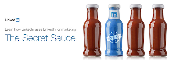
LinkedIn Marketing Solutions is all about mobilizing marketers to grow their audience, create more effective content, and, ultimately, achieve their goals. Naturally, LinkedIn wants its audience to leverage this service to achieve those goals. While it produces plenty of content related to the benefits of LinkedIn, the team has made a significant push into content that educates all levels of marketer on a variety of topics (as you can see on its blog).
This ebook , The Secret Sauce: Learn how LinkedIn uses LinkedIn for marketing, provides a ton of insider information about how LinkedIn itself uses the platform to achieve its marketing goals.

How it shows empathy:
One immensely effective empathy marketing tactic is education. LinkedIn wants to empower its audience to do work better (and use its product to do so), and this ebook is the single tool they need to understand and confidently use LinkedIn like the pros -- even the pros at LinkedIn headquarters.
Through offerings like this, customers learn that they can rely on LinkedIn as a trusted source to guide them in the right direction, and LinkedIn can continue to provide solutions through its product offerings. It’s a win-win all around.
3) The Home Depot
Content Type : Infographic
The Home Depot is a home and garden supply store that caters to all types of builders and DIY-ers -- whether you're a construction worker building a gazebo or a homemaker experimenting with gardening. In other words, their content must cater to various demographics.
As Home Depot is all about the DIY, its marketing focuses on what its supplies can help you do -- not just what the supplies are. This "Grow a Living Salad Bowl" infographic teaches consumers to grow their own salads, offering information on how to do it, which vegetables grow best, and what supplies they need -- all with minimal branding.
How it shows empathy:
The Home Depot's customers dream of being skilled DIY-ers, but need a bit of help working through the unknown, as well as some encouragement. This infographic delivers on these, and inspires customers to take action.
4) Extra
Content Type : Interactive Site
We’ve seen just about every twist on gum marketing possible: sexy encounters, romantic trysts, and more. Extra is pushing past that narrative. The brand realizes that gum is an everyday part of life, a seemingly mundane product, but its omnipresence means it’s there for many of life’s little moments. Hence, the #givextragetextra campaign is all about celebrating those moments -- the awesome fishing trip, the road trip with friends, the engagement -- by turning them into art.

The interactive site and social campaign encourage you to submit photos of those everyday moments to be turned into sketches, some of which appear on the inside flap of Extra packaging. At the site, you can see the images, watch a video of the artist’s sketches, peruse the gallery, and search to see if your submission has been turned into art.
How it shows empathy:
In many ways, gum is a product meant to enhance intimacy, making your breath fresh for more closeness. In our techno-connected world, those everyday moments of intimacy are often overlooked. This campaign helps customers become more aware and celebratory of those moments. By encouraging them to capture and share those memories -- and honoring them through the gum-wrapper art -- Extra is helping customers live a more full and present life.
5) Microsoft
Content Type : Interactive Infographic
Microsoft’s security solutions are all about keeping consumers’ data safe. The brand's goal, then, is to educate and explain why its products are important. That said, data security is not the sexiest topic -- not to mention plenty has been said about it.
To give it a new twist, Microsoft created the Anatomy of a Data Breachinteractive site, which explains the issue of data security through a relevant lens: the data heist.

The site puts consumers in a hacker’s shoes, guiding them through the stages of a data breach and showing, in detail, exactly how the data is stolen. Coupled with statistics about data security, the messaging is clear.
How it shows empathy:
Consumers know data breaches are a problem, but they don’t know exactly how they happen (seriously, how do these keep on happening? Asking for a friend.) By making an engaging story and using real consumer survey data, Microsoft brings the problem to life in a genuine and accessible way. Through the interactive, customers truly see their vulnerabilities and better understand how to protect themselves.
6) Michael’s
Content Type: Blog
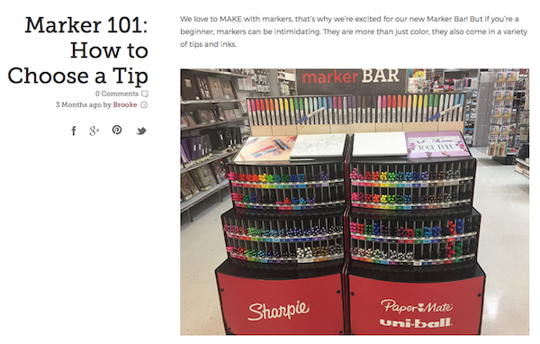
In a world where Pinterest dominates, Michael’s chain of craft stores is making a play to capture its own audience on its own properties. The brand has long provided the standard craft tutorials and product features on its site, but with The Glue String blog, Michael's is inserting itself into its readers’ lifestyles with a variety of content.
Posts like “Marker 101: How to Choose a Tip” may sound a little silly, but for avid crafters, these are the exact types of posts that are relevant to their lives. The beautiful layout and high-impact visuals only help to bring these stories to life.

How it shows empathy:
Crafting is an exciting hobby, but not without its own frustrations. Providing useful tips and hacks on how to do things better via a free publication helps readers do more of what they love with fewer headaches. Additionally, fans get to share their enthusiasm through social, helping Michael’s extend its reach while helping their audience show their interests off.
7) JetBlue
Content Type: Video
JetBlue is a brand known for superb customer service and humor. At this point, we know where it flies and we know its hook, so its marketing needs to extend beyond the services provided. As such, JetBlue's content is focusing more on the world of flying and the experiences we all have.
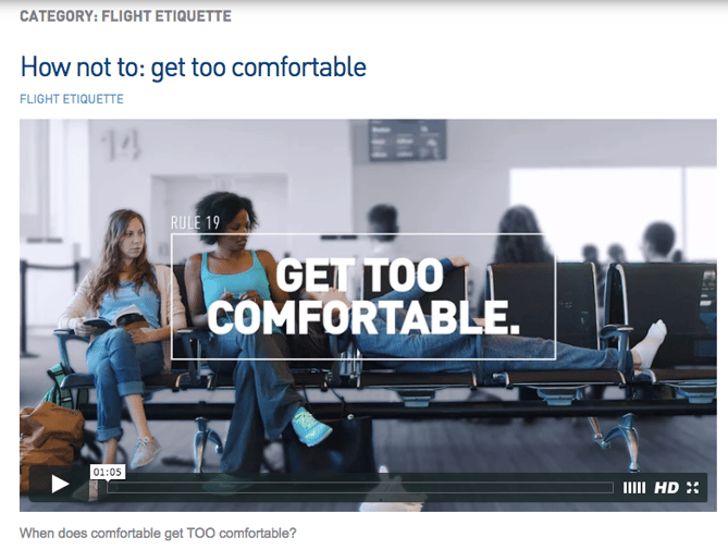
The Flight Etiquette videos are funny PSAs that spotlight some of the most pervasive problems we encounter while traveling: overzealous flight boarding, chatty seatmates, etc. By giving it the sarcastic “How NOT to” twist, JetBlue showcases its humor and brand voice.

How it shows empathy:
There are specific instances that make the flying experience suck for all of us. These videos attempt to remedy these troubles by commiserating with and educating the public.
8) J.Crew
Content Type : Visual How-Tos
J.Crew is a sophisticated clothing brand that has always marketed toward lifestyle, framing its clothes within that context. While it has a devoted following, it's always searching for ways to more deeply connect with its audience.
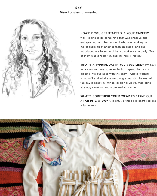
The company's blog is a fantastic outlet for that. Naturally, as design is a core part of its business, it is a major component of publishing. Its clean design superbly showcases J.Crew products, tips, and tricks. And, it consistently uses on-brand visuals to enhance the content. For example, "How to Get (and Dress For) the Job You Want" includes interviews, expert advice, and vibrant visuals to tie together the discussion with some ideas of exact outfits to buy.

How it shows empathy:
Many J.Crew customers go shopping to find a great interview outfit to make the perfect first impression. Giving customers more options to express themselves -- and be successful --- through clothing helps them achieve that.


No comments:
Post a Comment
Note: Only a member of this blog may post a comment.