Wednesday, February 14, 2018

Design Trends for 2018

Design Trends for 2018

What it looks like
These sites have gone all in on the 90s tech theme!
image3.png
01 | Balance between new and old
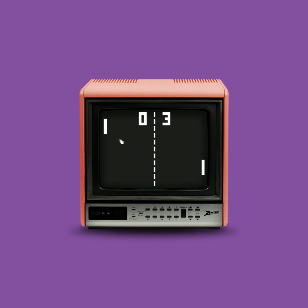
There’s something calming about the combination of the past and future, which is exactly what this campaign from Etienne Godiard plays into. There’s no wonder it’s the first piece featured on the homepage!

design-trends-90s-tech-station.png
02 | Quirky combinations
When you land on the Station site, you’re greeted with a scene that may look like it’s straight out of the 90s, but with a video element that takes it to a whole different place! The interaction on this site is great, encouraging users to explore to see what happens next.

Screen Shot 2018-02-06 at 12.20.19 PM.png
03 | Embracing old habits
Remember all the quirky ways we used to interact with old technology? That’s exactly what Brandon Barber has recreated with his portfolio site. Typing in commands totally works, and it’s super fun to interact with.
TV.png
Get the look

No comments:

Post a Comment

Note: Only a member of this blog may post a comment.

Featured Post

Computers in Art Practice:Manfred Mohr

Artist Manfred Mohr Since 1969, Manfred Mohr has used computers and plotters as electronic and digital drawing aids, thus making inevita...