Check out these links.
http://www.tigercolor.com/color-lab/color-theory/color-theory-intro.htm#color_harmonies
http://www.tigercolor.com/color-lab/color-theory/color-theory-intro.htm#color_harmonies
http://www.colormatters.com/color-and-design/basic-color-theory
http://www.smashingmagazine.com/2010/01/color-theory-for-designers-part-1-the-meaning-of-color/
http://www.color-wheel-pro.com/color-meaning.html
http://www.colourlovers.com/
http://www.cssdrive.com/imagepalette/


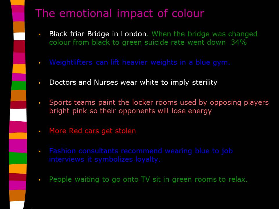


How is Colour used in Design
1. Convey information.
2. Create colour harmony.
3. Attract and hold attention.
4. Remember that context is everything.
5. Consider that experimentation is key.
6. Know that people see colour differently.
7. Assist in mnemonic value.
8. Think about composition.
9. Use standardized colour systems.
And finally, RULE 10: Understand limitations.
It has been said that necessity is the mother of invention, and naturally, that applies to graphic design as well. Sometimes budget constraints are a limiting factor that wears down and frustrates designers. Stretching design dollars does not mean that down and dirty must be ugly and ineffective. Effective colour usage can provide impact and beauty on a limited budget. Financial concerns are not the only reason for limiting the number of colours specified; sometimes it is a question of aesthetics as well.
Using only a few colours, perhaps on coloured stocks, can result in a rich-looking piece. Pushing the boundaries with limited resources often means pushing the limits of production technology or thinking of new ways to incorporate old manufacturing techniques and materials. Stretching design dollars means embracing and leveraging limitations. However, it is best to understand the client’s budget up front so designs can be formulated within it.
Colour is such a pervasive part of everything we visually encounter in the world, that for many designers it becomes an intuitive choice. If you think back to primary/elementary school though, you'll recall being told that there are three 'primary' colours – Red, Yellow, and Blue. We were all taught that any colour can be created by mixing these three colours in varying quantities.
It turns out this isn't quite right (although it's still workable enough in practice to be taught the world over to five-year-olds).
How colour is formed

Colour theory stretches back to at least the 15th century
Understanding how colour is formed and, more importantly, the relationships between different colours, can help you to use colour more effectively in your designs.
The Bauhaus school understood this in the 1920s and 1930s, with staff and students going on to develop colour theories for evoking particular moods and emotions through choice of palette in design and architecture.
The theory of colour is a discipline that stretches back much further than that - at least to the 15th century - and encompasses physics, chemistry and mathematics to fully define and explain the concepts. However, much of this is unnecessary to being able to use colour effectively. This quick primer will give you a handy overview of all the important aspects to help you start making informed decisions.
Colour systems
There are two primary colour systems – methods by which colour is reproduced: additive and subtractive (also known as reflective). We use both on a daily basis – the screen you're reading this article on uses additive colour to generate all the colours you see, while the book you're reading uses subtractive colour for its front cover.
In simple terms – anything that emits light (such as the sun, a screen, a projector, etc) uses additive, while everything else (which instead reflects light) uses subtractive colour.
01. Additive

Additive colour is based on red, green, and blue - RGB for short
Additive colour works with anything that emits or radiates light. The mixture of different wavelengths of light creates different colours, and the more light you add, the brighter and lighter the colour becomes.
When using additive colour, we tend to consider the building block (primary) colours to be Red, Green, and Blue (RGB), and this is the basis for all colour you use on screen. In additive colour, white is the combination of colour, while black is the absence of colour.
02. Subtractive
Subtractive colour is based on cyan, magenta, and yellow
Subtractive colour works on the basis of reflected light. Rather than pushing more light out, the way a particular pigment reflects different wavelengths of light determines its apparent colour to the human eye.
Subtractive colour, like additive, has three primary colours - Cyan, Magenta, and Yellow (CMY). In subtractive colour white is the absence of colour, while black is the combination of colour, but it’s an imperfect system.
The pigments we have available to use don't fully absorb light (preventing reflected colour wavelengths), so we have to add a fourth compensating pigment to account for this limitation.
We call this "Key", hence CMYK, but essentially it's black. Without this additional pigment, the closest to black we'd be able to render in print would be a muddy brown.
The colour wheel

The modern colour wheel has been in use since the 18th century
In order to make it easier to see the relationship between different colours, the concept of the modern colour wheel was developed around the 18th century. These early wheels plotted the different primary colours around a circle, mixing different primary colours together in strict ratios to achieve secondary and tertiary colours.
The colour wheel allows us to see at a glance which colours are complementary (opposite each other on the wheel), analogous (adjacent to each other on the wheel), triadic (three colours positioned at 120 degrees on the wheel from each other) and so on.
Each of these relationships can produce pleasing colour combinations. There are many more pleasing relationships between colours based on their position on the wheel. Software such as Adobe Kuler use to help you generate effective colour themes.
The three components of a colour

The three component parts that help us define a colour are hue, saturation and brightness
Yellow is yellow is yellow, right? Well, actually, no; there are many different colours we could refer to as yellow. Different shades or tints, saturations and hues are all possible while still being within the yellow part of the colour wheel. As a result, there are three primary component parts that help us define a colour:
01. Hue
This is the position on the colour wheel, and represents the base colour itself. This is typically referred to in degrees (around the colour wheel), so a yellow colour will appear between 50 and 60 degrees, with the perfect yellow appearing at 56 degrees. Green, meanwhile, appears at 120 degrees on the wheel at so on.
02. Saturation
This is a representation of how saturated (or rich) a colour is. Low saturation results in less overall colour, eventually becoming a shade of grey when fully desaturated. Saturation is normally referred to as a percentage between 0 and 100%.
03. Brightness
This is how bright a colour is, typically expressed as a percentage between 0 and 100%. A yellow at 0% brightness will be black, while the same yellow hue and saturation at 100% brightness will be the full yellow colour.
Colour gamut

Colour gamut describes the range of potential colours a system can reproduce
Colour gamut is a way of describing the full range of potential colours a system can reproduce. It may surprise you to learn that the range of colours achievable in CMYK is different to that you can achieve with RGB.
This is partially because of the nature of the two different systems, but also (in the real world at least) as a consequence of limitations in our technology - screens aren’t always capable of producing the same range of colours as each other, and pigments reflect light at a non-uniform rate as you reduce their saturation.
Colour perception
Finally, it’s worth looking at how different colours can affect the way we perceive other colours. A typical illustration of this features a mid-grey tone placed over a light grey background, and the same mid-grey tone shown over a dark grey background.
The apparent brightness of the mid-grey is altered according to the context in which you see it - a trick of the eye, working to make sense of its surroundings. Hues works in the same way as tones when placed adjacent to other colours, allowing you to create different effects using the same palette of colours.


No comments:
Post a Comment
Note: Only a member of this blog may post a comment.