30 Fonts To Last A Life Time
—
Here are 30 of the Best Fonts / Typefaces that every designer must / should own sorted by alphabetical order. There are 15 seriffonts and 15 sans-serif fonts. These fonts will last you your whole career!
A brief description of what each font is best suited for is provided however are not limited to this.
There are some top free cool fontsthat are downloadable in this collection and some that come with your operating system… the others are not so free but they sure will help you improve your typography! They include original PC, Mac and Truetype fonts.
You may also be interested in How To Choose A Font or the Top 5 Typography Resources of all time. Also don’t forget to subscribe!
15 Serif Fonts
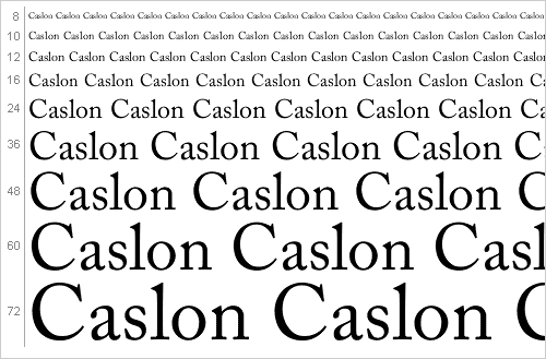
1. Adobe Caslon
Magazines, journals, text books, corporate communication.
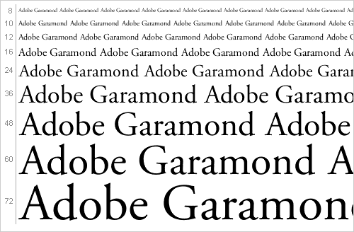
2. Adobe Garamond
Textbooks and magazines
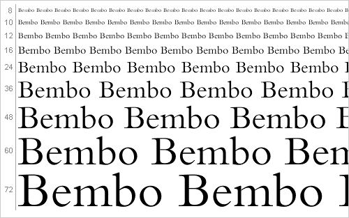
3. Bembo
Posters, packaging, textbooks.
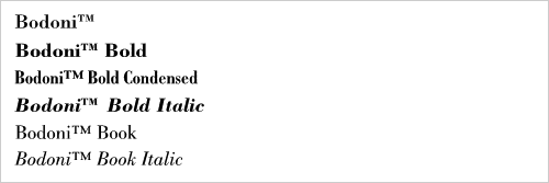
4. Bodoni
Headlines, text, logos. (I couldn’t get big preview for this font.)
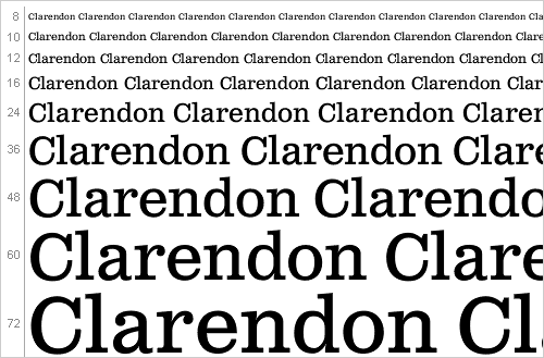
5. Clarendon
Dictionaries and headlines.
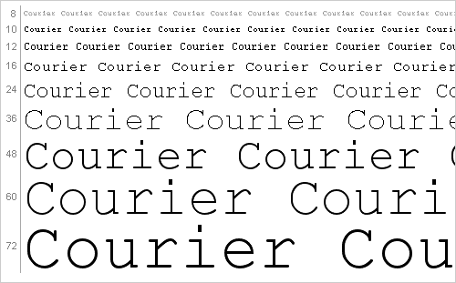
6. Courier
Tabular materials, technical documentation, word processing.
7. Excelsior
Newsletters, Reports, Proposals.

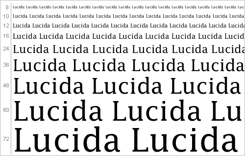
8. Lucida
Low resolution printing, small point sizes, reversed out half tones.
9. Minion
Limited edition books, newsletters, packaging.

10. Perpetua
For displays with fine lettering, long pages of text, chiseled text.

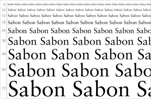
11. Sabon
Books and corporate communication.
12. Stempel Schneidler
For displays and fine publications that need a legible text type.

13. Times New Roman
Newspapers, magazines, corporate communication.

14. Trajan
Books, magazines, posters, billboards, anything to do with the ages or religion.

15. Walbaum
Magazines, journals, text books, corporate communication.


UNLIMITED DOWNLOADS:400,000+ Fonts & Design Assets

All the Fonts you need and many other design elements, are available for a monthly subscription by subscribing to Envato Elements. The subscription costs $29 per month and gives you unlimited access to a massive and growing library of400,000+ items that can be downloaded as often as you need (stock photos too)!
15 Sans-Serif Fonts
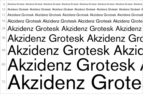
1. Akzidenz Grotesk
Large Signage, all purpose for print media.
2. Avenir
For books with large amounts of text

3. Bell Centennial
For listings and very poor printing conditions.

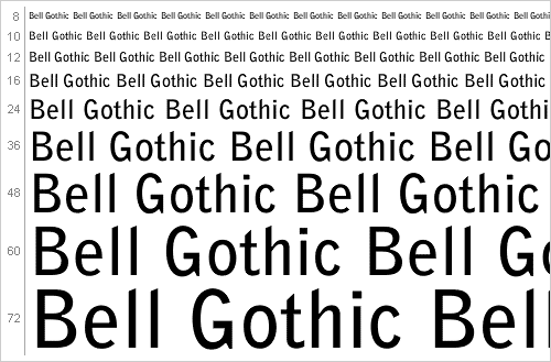
4. Bell Gothic
For very small amounts of text that contains large amounts of information.
5. DIN
For signage, posters and displays.

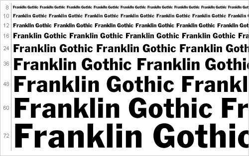
6. Franklin Gothic
Newspapers and where available space is limited.
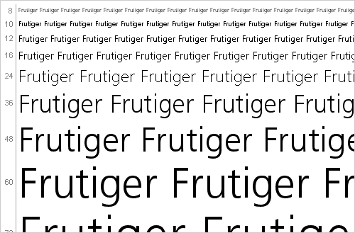
7. Frutiger
Large signage, all purpose font for print media.
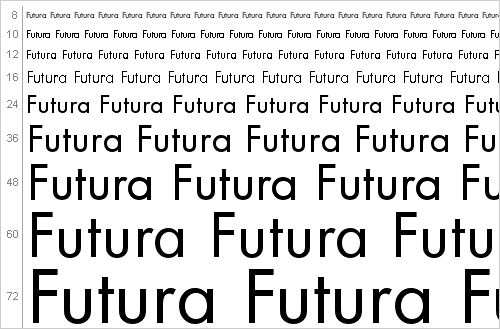
8. Futura
Large displays, small text in books.
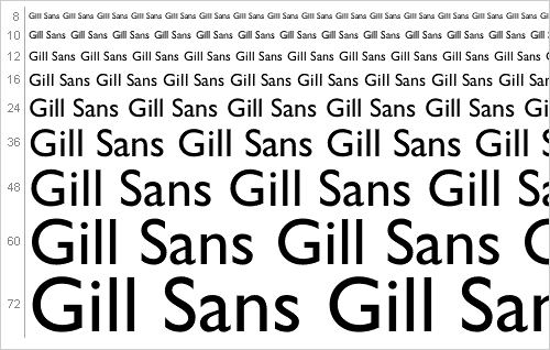
9. Gill Sans
Signage, all purpose font for print media.
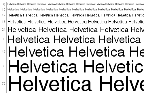
10. Helvetica
Large or small text, all purpose type figure.
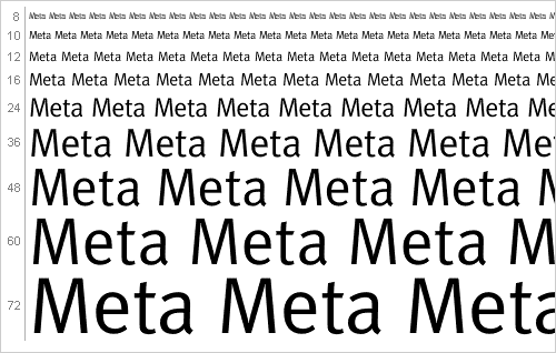
11. Meta
Text, number, especially corporate communication.
12. Myriad
Large displays, all purpose media.

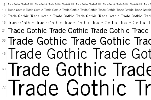
13. Trade Gothic
Newspapers and classified ads, advertising, multimedia.
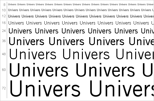
14. Univers
Packaging, signage, text books.
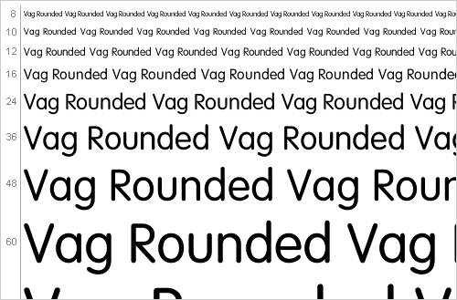
15. Vag Rounded
Instruction manuals and print advertising.
Source: From the book “30 Essential Typefaces for a Lifetime” by Imin Pao and Joshya Berger. A history of typography is also found in this book as well as more information on each font and the designer.
To buy most of the fonts above I would recommend MyFontshowever you must shop around!
Don’t forget to subscribe to this blog so you don’t miss out on future posts!
What are your favourite 3 fonts? Any fonts that should or shouldn’t be here?
Sent from my iPhone