http://www.designishistory.com
Friday, September 13, 2019
Movie Posters and Their Typography
Movie Posters and Their Typography
Horror Movies
Movie posters are a crucial part of sales. Not only do they help persuade people into going to the theater, they also help movies stand out from one another. Without typography, a movie poster is just an image. Without a title there would be no movie. Typography is a wonderful tool; it helps further express the emotion, tone, feeling, and style in your image.
Whether your movie is horror, drama, action, comedy, or a mix between these, each poster has the potential to have its own unique look and feel…or so I thought. Because movie sales are on the line, designers tend to do what’s trusted and proven rather than what would do the particular movie justice. Don’t get me wrong, there are many amazing examples of original typography in movie posters out there currently, but it’s disappointing to find out how many generic ones coexist among them. To prove my point, I’ve raked through the dark depths of Netflix to show how generic and uninspired movie poster typography really can be.
When it comes to horror, the poster can be enough on its own to entice someone to spend an hour and half with the movie. Among the thousands of typographic possibilities, the bold red sans serif title seems to be an industry favorite. Yes, red does attract people’s attention and insinuate horror, but Helvetica is everything but scary.

Action Movies
Action movies are fun, fast, and full of adventure. To communicate this, it seems that the go-to is skewing the type to make thing look in motion. Maybe it wouldn’t seem so predictable if every poster that did this didn’t add a flame overlay behind it and make the font look like it came flying in from off the page.

Romantic Movies
And then there are the romantic comedies. With one look at the poster, you know what you’re in for: a gentle ride with a few laughs and tears, complete with a storybook ending. A lot of these have really nice font choices and lock-ups, but when they’re sandwiched between colorful mosaics of the actors’ faces on a white background, nothing really stands out.

Indie Movies
Indie movies are no different either. It seems that the only way to make sure the public knows your movie will be quirky but soft spoken is to hand-letter the title. I’m a big fan of narrow hand-drawn text, but the more it’s used, the less I appreciate its whimsicality.
Looking ahead, I’d love to see the typography handled more carefully. Instead of immediately assuming that the type for a horror movie needs to be red and bloody, I’d like to see designers thinking about what style and lockup is appropriate for that individual movie based on the plot, the cinematography, and anything else that makes that movie different from other movies. Although the purpose of movie posters is to attract the broadest audience, I hope the industry can get back in touch with their design sense.
Serif or Sans Serif ?
Serif or Sans Serif ?
Refer the image below to understand which is which.
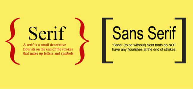
One of the first determinations to be made when selecting a typeface for text is Serif or Sans Serif?
Many experts say that Sans Serif fonts are a better typeface recommendation in videos as they appear bold and neat while they transit.
Serif on the other hand is a font commonly used for the print media. The letters adorned in strokes gives an outlook of a classic style mixed with a modern imprint and it goes well with newspapers.
The other classifications of the font family consists of Scripts and decorative. Scripts are what we might think of as cursive or handwriting-style fonts. They generally have connected letters. You’ll find that script fonts come in many different styles, from elegant, to fun and casual, to hand-drawn.
When you hear a font categorized as decorative, display, or novelty, it all means the same thing — that font is meant to get your attention. They’re often more unusual than practical and should only be used in small doses and for a specific effect or purpose.
The personality of a font
Typography is a visual summary. You make the words convey the emotion. There is something in the way the tracking, the leading and the kerning of an alphabet moves. Together it defines the ‘mood’ and ‘personality’ of the fonts.
For instance, you want to choose a stylish font for the name of the website. You surely would not opt for a boring Arial, or a Calibri font for the font design. Instead, you would go for something snazzy and unique; something that conveys the site’s ambience by its very look and displays the zeal the name carries.
Yes. Fonts have a personality.
We have thus categorized fonts from our very own Animaker library to share our insights on which font would suit your video the best under different scenarios.
Being Formal in Presentations
When you are making a video for a presentation, you have to make sure that you choose a text that is plain, clear and loud. It can either be a Serif or a Sans Serif. The best fonts that work well with presentation videos are Arial, Arvo and Calibri.
1. Arvo
You can download the font here
2. Arial
3. Calibri
Make sure that there are no flourishes at the end of the strokes. Using a minimalistic font is the best option for a video presentations. It makes your data look more readable and elegant at the same time.
Ambience in Celebrations
Whenever you want to announce something big, I recommend you to use this class of fonts. The list includes
4. Oleo script
You can download the font here
5. Allerta Stencil.
You can download the font here.
6. Bevan
You can download the font here.
If you notice, there is something different in each font of this class and that is what makes them unique. The very look of the fonts induces a sense of celebration in us. You can use this font for promotional offers of your product during the holiday season.
Being bold and Loud
Be bold and stand up with confidence. This class of fonts have strong and thick strokes that exhibits a certainty and a confidence in the way it looks.
7. Paytone 1
You can download the font here
8. Montserrat
You can download the font here
9. Khand
You can download the font here
10. Oswald
You can download the font here
In addition, you can also use this font for headings or headlines.
Being simple and minimalistic
Fonts like Nixie One, raleway, Josefin sans can be used to convey an air of casualty in the video. With simple and minimalistic designs, these fonts can be most widely used in most of the video content.
11. Raleway
You can download the font here
12. Nixie One
You can download the font here
13. Josefin sans
You can download the font here
Speech monosyllables
There are certain comical fonts like loved by the king, Gochi Hand, Amatic and Sacromento that can be used extensively in storytelling. Since these fonts are mostly handwritten, it gives an element of a personal touch to your video.
14. Loved by the king
You can download the font here
15. Gochi hand
You can download the font here
16. Amatic
You can download the font here
17. Sacromento
You can download the font here
Add a techie touch
To add a bit of a techie touch to your video, the fonts mentioned below could be a great choice. Fonts like VT323, Special elite and text me one gives a typewriter feel to your video.
18. VT323
You can download the font here
19. Special Elite
You can download the font here
20. Text Me One
You can download the font here
Friday, May 17, 2019
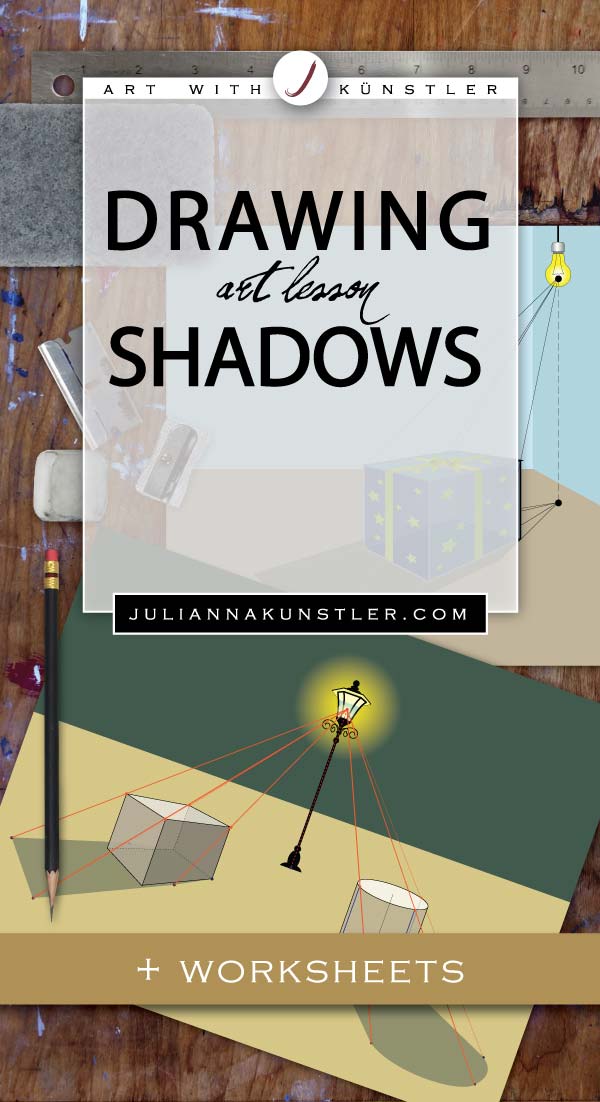
Creating shadows

shadows
drawing the right way
by JuliannaKunstler.com
Drawing shadows is an important part of a 3-D drawing. You need to understand the geometry behind this process to make your drawings most life-like. It is not as hard as it looks.
Drop shadow is a shape that is created by an object on a surface (or multiple surfaces) by blocking the light.
To see a drop shadow you need a light source.
in this tutorial:
shadow of a point

shadow of a line
shadow of a box
shadow of a cylinder
shadow of a cone
natural light shadow
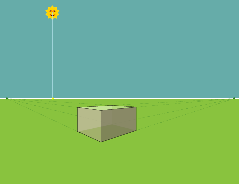
STEPS
light
There are two types of light sources: natural (sun, moon) and artificial (lamp, candle, flash-light, etc).
natural light
Our natural light sources ( Sun and Moon) are quite far away. Building a shadow will involve some of the linear perspective elements (horizon line).
artificial (spot) light
Spot light is much closer to us. We can position it more accurately in our environment - we can tell exactly how far it is from the object and how high it is from a surface.
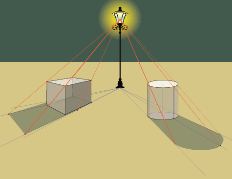
you need to know:
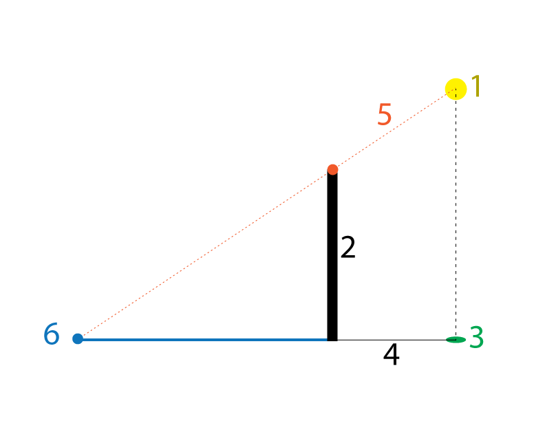
1 - Light source (yellow dot)
2 - Object
3 - Light source ground mark - position of the light source on the surface or ground (green dot)
4 - Line, connecting the position of the light source and the bottom of the object (black line)
5 - Line connecting the light source (1), the top of the object (red dot), and Line 4 - defining the end point of the drop shadow (6)
6 - The end point of the drop shadow on the surface
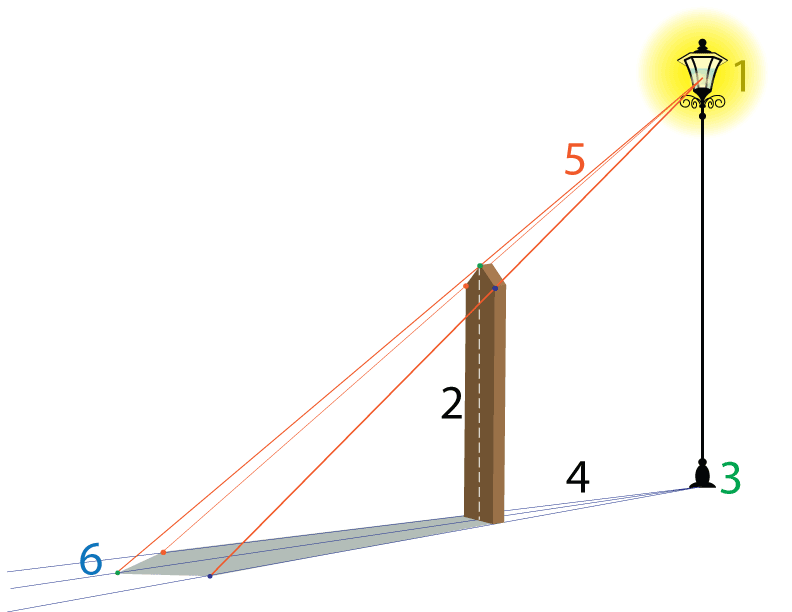
This rule is applied for both types of the light source and for all forms and objects.
There is only one difference:
diffused light source
The lines 4 are parallel as the light source is not defined (cloudy day, window, very large light source, etc) so we don't need to draw a yellow dot (1).
Lines 5 are also parallel for exactly the same reason.
spot light
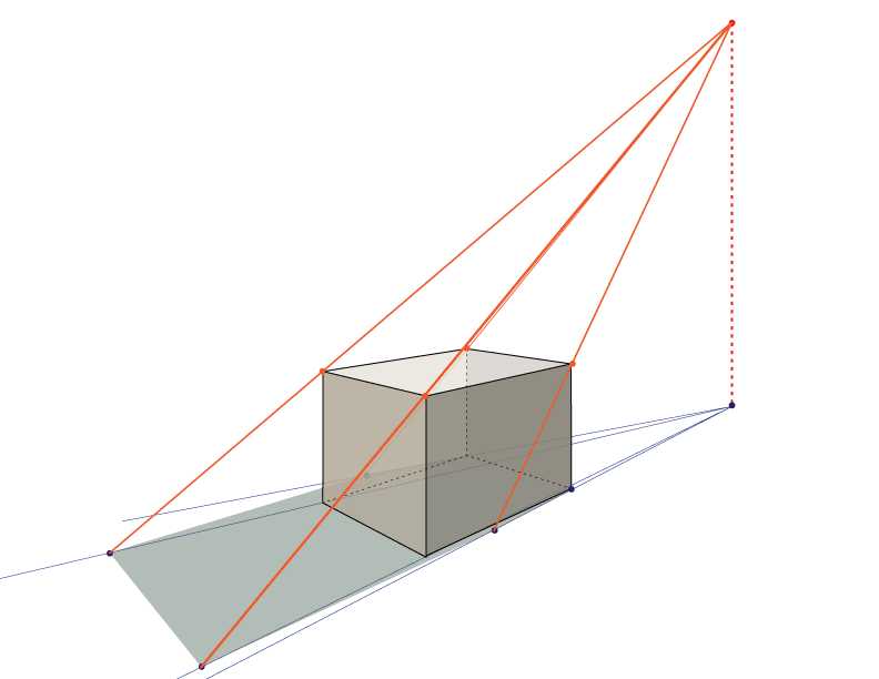
Each corner point follows the above rule to form an exact shape of the drop shadow.
spot light
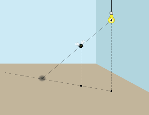
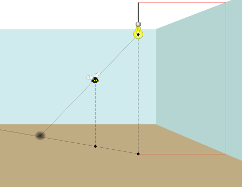
shadow of a point
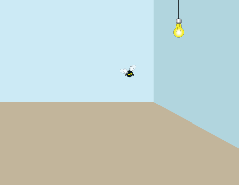
Imagine that you need to draw a drop shadow of a very small round object, almost a dot. Let's draw one of a fly. Why not?
So here we have a room with one spot light and a fly. The ground surface is the brown floor - this is where we are going to place the shadow.

The first thing you do is mark the position of the light source on the floor (light ground mark).
You do it by drawing a straight vertical line down to the floor and marking the point on the floor that is exactly below the light.
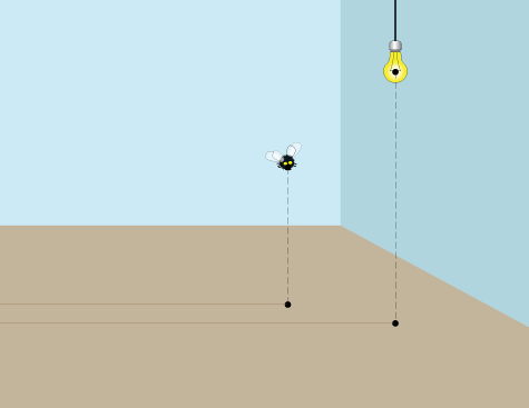
Now you need to mark the position of the fly on the floor (object ground mark).
Please note the position of the light and the fly in respect to each other - in my case, the light is closer to me than the fly (you don't need to draw the brown horizontal lines - they are just for a reference).
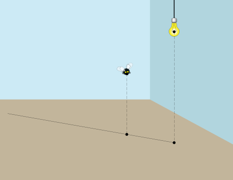
Now connect the light ground mark and the object ground mark on the floor with a line - it will define the direction of where the shadow will appear on the floor.
Great!
One more construction line, and you're done!
Draw a line from the light through the fly - all the way to the ground.
The intersection will mark the position of the drop shadow!
Please note:
If you have a reference point for the light source in your drawing - then you do not need to guess or estimate your ground light mark.
For example: the light source is attached to a ceiling or a wall.
shadow of a line
flat shadow
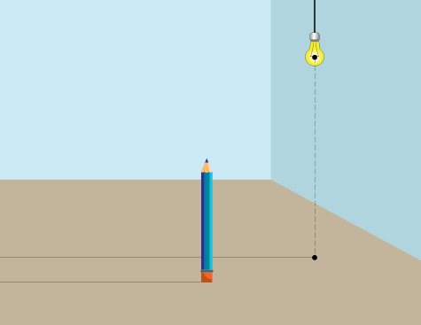
Drawing a shadow of a line is, actually, a bit easier - you don't need to define the position of the object on the floor!
So, start, again, with defining the position of your light on the ground surface (floor) - place the light ground mark. Please note, that in this case my object (pencil) is closer to me that the light.

Connect the light ground mark with the bottom of the line (pencil, in this case).
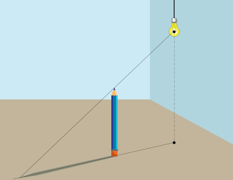
Now draw a line (light ray) from the light through the tip of the line (pencil).
That will define the length of your drop shadow.
bent shadow
In case you need to draw a shadow that falls on multiple surfaces (floor and walls) - use the same steps, just tweak them a little.
Let's say your line (another pencil) is close to the wall. The drop shadow will fall on both the floor and the wall. This is how you do it:

Just bend the line when it hits the wall!

Draw a line from the light through the top of the line (pencil) as shown:
That's it!
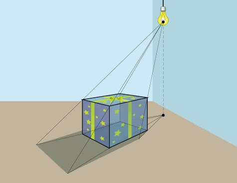
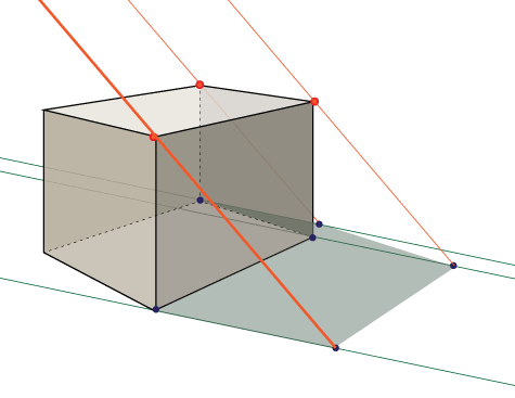
shadow of a box

Drawing a drop shadow of a cube (box) is a repeated use of the same technique as we did with drawing s shadow of a line.
You will have to repeat the steps with all corners that form a shadow.
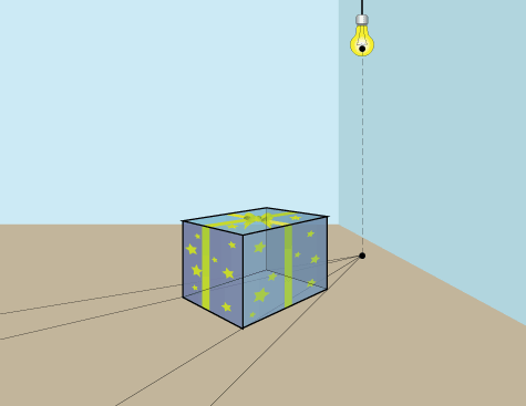
As you already know, the best way to draw 3-D forms is to draw them with "see-through sides" - as if the form is made of glass.
Connect the light ground mark with all bottom corners:
Draw lines from the light through the top corners of the box.
The intersections are the points that form a shadow shape. All you have to do now is to connect the dots!
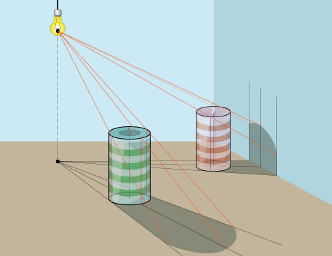
shadow of a cylinder

The same technique is used to draw a shadow of a cylinder, with a few minor adjustments.

Keep all construction lines (axis of symmetry, ovals):

Draw lines from the light ground mark through the widest parts of the bottom oval:

Also, draw a line through the bottom of the axis of symmetry.

Draw vertical lines from the bottom ovals to the top ovals as shown.
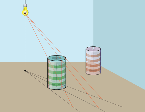
Draw lines from the light through the top oval's dimension points like this:
Time to trace the shadow. The two sides are straight lines that follow the ground lines. The middle (axis) projection is the furthest point of the shadow. Connect the three dots with a curve.
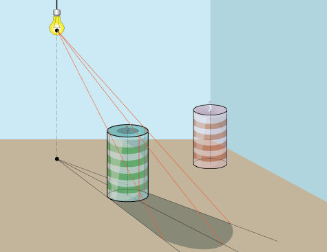
Drawing a shadow of a cylinder on multiple surfaces is like drawing a shadow of a line on multiple surfaces:
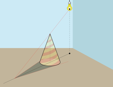
shadow of a cone
Start with placing a cone on the floor.
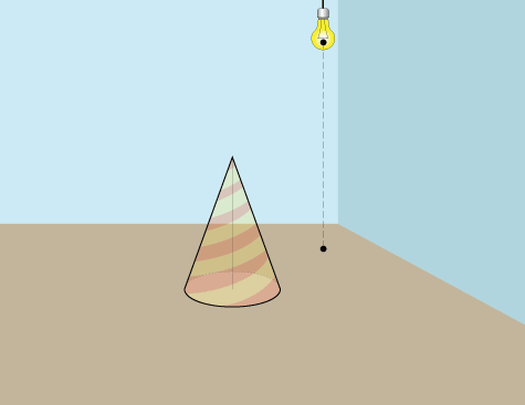
Have all construction lines in place (axis of symmetry, bottom oval)
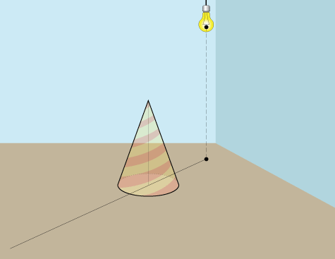
Draw a line from the light ground mark and the bottom of the axis of symmetry
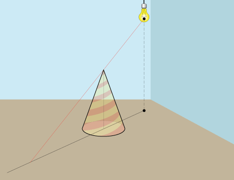
Draw a line from the light through the top of the cone to the ground line.
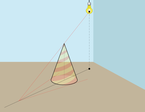
Draw lines from he point of the top's shadow through the widest parts of the oval
The shadow is done!
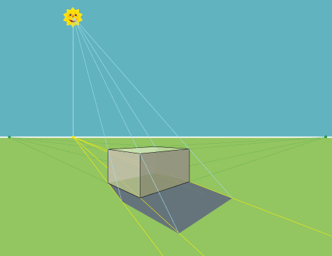
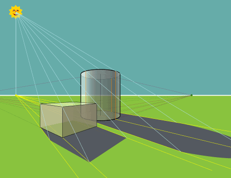
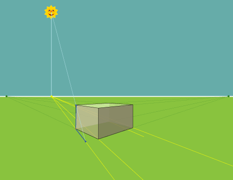
natural light

Place an object on a ground.
Define HORIZON line.
Because the Sun is so far away - we mark its position reference point on the horizon line.
Just draw a straight line down.

From the Sun reference point draw a line through a bottom corner of the box.

Then draw lines through each bottom corner.

From the light source - draw a line through the top corner of the box until it reaches the ground line.
That will start defining the area that is blocked from the light source.
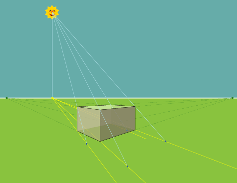
Draw the rest of the lines from the light source.
Mark the crossing points.
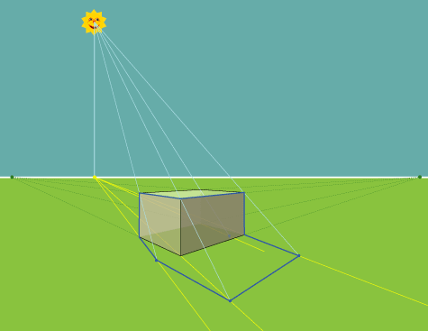
Connecting all points will create a shadow outline.
Shade the shadow.
It is usually getting lighter as it gets further away from the object.
...
Subscribe to:
Posts (Atom)
Featured Post
Computers in Art Practice:Manfred Mohr
Artist Manfred Mohr Since 1969, Manfred Mohr has used computers and plotters as electronic and digital drawing aids, thus making inevita...

-
 Able to understand why a design brief is critical to the design process Explain the purpose of a design brief The design ...
 -
 Principles of marketing and evaluation 1 .1 explain the importance of defining market segments to the developm...
 -
 What is a sales funnel? A sales funnel is a visual representation of the steps required to sell your products or services. A sales funnel s...
 -
 How to Create Effective Marketing Campaigns by Sam Ashe-Edmunds Related Articles 1 Top Ten Promotional Strategies 2 How to I...
 -
 Develop Design Principles and Techniques and Processes for Designing Products Give examples of how formal elements and principles of...
 -
Adobe Illustrator is the perfect tool for creating abstract art with basic shapes and lines. In today’s tutorial I’ll show you how to creat...
-
 Understand the formal elements and principles of design Give examples of how formal elements and principle...
 -
This is the ability to use IT tools and devices for collaborative working and communications, such as web or video conferencing, instant me...
-
 Understand how to organise and evaluate data that has been researched. 1.1 describe purpose and benefits of organising data so that it c...
 -
 Personal and professional development Einstein stressed that lifelong learning should be a focus because personal growth stops whe...
